Error message
Please set or check the UMD Today Calendar API Bearer token on the UMD Terp modules configuration page.In Web Design, the term Kitchen sink, comes from the phrase "everything but the kitchen sink" or "everything and the kitchen sink". The Kitchen Sink page is meant to BE everything in one place, so you can compare and contrast available options for a site.
Each section on this page includes a link to its relevant guidelines page with detailed instructions for adding widgets and content to your site.
Text
Text widgets and "Rich Text areas" in general support a number of formats by default with "Basic HTML" text formatting including Normal text, Headings 2 through 6, Links, Bold, Italics, Numbered lists, Bulleted lists, Blockquotes, and Images. You will find the same format options in the Rich Text Areas of other widgets, as you do in the Text Widget
Text fonts, sizes, and styles:
Heading 2: Crimson Text, 42px
Heading 3: Source Sans Pro, 28px
Heading 4: Crimson Text, 26px
Heading 5: Source Sans Pro, 22px
Heading 6: Source Sans Pro, 20px, All Caps
Normal: Source Sans Pro, 18px
Normal text formatted with bold
Normal text formatted with italics
Links are formatted to match the templates. Avoid using non-descriptive terms like "Click Here", "Read More", or similar terms that provide little to no context for what someone will be clicking on while using screen readers or similar accessibility tools.
Headings should be short and to the point. A very long title, like this one, will return to a new line, and can be overwhelming.
Use an Accessible Heading Order
For accessibility compliance, use Headings in numerical order, as if creating a list outline, and without skipping any. “Normal” text is the exception, and can appear anywhere in that order. Skipping a heading for any reason (i.e.: using a Heading 1, followed by a Heading 3, and skipping Heading 2) can cause confusion, especially for someone who relies on a screen reader to browse a site. Users might think they missed some piece of content. Learn more about accessibility compliance for headings, and general accessibility compliance at the Web Accessibility Initiative.
| Accessibility Assessment | Example Text |
|---|---|
| Passes Assessment | Heading 2Heading 3Heading 3 AgainHeading 4Heading 5Heading 2 AgainHeading 3Heading 3 Again |
| Fails Assessment | Heading 2Heading 5 (Fails because Headings 3 and 4 were skipped)Heading 2 AgainHeading 4 (Fails because Heading 3 was skipped)Heading 5Heading 5 Again |
Numbered list
- Item 1
- Item 2
- Item 3
- Sub Item 1
- Sub Item 2
- Third Level Item 1
- Third Level Item 2
- Sub Item 3
- Item 4
- Item 5
Bulleted list
- Item 2
- Item 1
- Item 3
- Sub Item 1
- Sub Item 2
- Third Level Item 1
- Third Level Item 2
- Sub Item 3
- Item 4
- Item 5
Mixed list (Numbered and Bulleted)
- Ordered list Item A
- Ordered list item B
- Sub bulleted list item 1
- Sub bulleted list item 2
- Ordered list item C
- Bulleted list item 1
- Bulleted list item 2
- Sub numbered list item 1
- Sub numbered list item 2
- Bulleted list item 3
Images can be added into text sections with Left, center, right, or no alignment
Examples of images at different alignments below with filler text to show what they look like. On mobile they will re-align to take up the full width of the screen.
Filler Text: Bibendum enim facilisis gravida neque convallis. Erat imperdiet sed euismod nisi porta lorem. Elit sed vulputate mi sit amet mauris. Ut aliquam purus sit amet luctus venenatis lectus magna. Blandit turpis cursus in hac habitasse. Sollicitudin tempor id eu nisl nunc mi ipsum. Facilisi morbi tempus iaculis urna id. Bibendum at varius vel pharetra vel turpis nunc. Semper risus in hendrerit gravida rutrum quisque. Etiam dignissim diam quis enim. Blandit turpis cursus in hac habitasse platea dictumst quisque. Vel pharetra vel turpis nunc eget. Cursus metus aliquam eleifend mi in. Eleifend mi in nulla posuere sollicitudin aliquam ultrices sagittis orci. Duis at tellus at urna. Aliquam vestibulum morbi blandit cursus risus at.
Vivamus at augue eget arcu dictum varius. Nam aliquam sem et tortor consequat id porta nibh venenatis. A arcu cursus vitae congue. Non consectetur a erat nam at. Non arcu risus quis varius quam quisque id. Eros donec ac odio tempor orci dapibus ultrices in iaculis. Massa ultricies mi quis hendrerit dolor magna eget est lorem. Ac tincidunt vitae semper quis lectus nulla at. Et leo duis ut diam quam. Tempus quam pellentesque nec nam aliquam sem et tortor.
Id diam maecenas ultricies mi eget mauris pharetra. Volutpat sed cras ornare arcu dui vivamus arcu felis. Amet nisl suscipit adipiscing bibendum est ultricies. Vel pretium lectus quam id leo in. Blandit volutpat maecenas volutpat blandit aliquam etiam erat velit scelerisque. Enim neque volutpat ac tincidunt vitae semper quis lectus nulla. Enim ut sem viverra aliquet eget sit amet. Cras adipiscing enim eu turpis egestas. Netus et malesuada fames ac turpis egestas. Etiam erat velit scelerisque in dictum non consectetur a.

Mollis nunc sed id semper risus in. Ante in nibh mauris cursus mattis. Aliquam nulla facilisi cras fermentum odio eu feugiat. Aliquam ut porttitor leo a diam sollicitudin tempor. Sagittis eu volutpat odio facilisis mauris. Ut diam quam nulla porttitor massa id neque aliquam. Risus nec feugiat in fermentum posuere urna nec tincidunt praesent. Id donec ultrices tincidunt arcu. Vitae purus faucibus ornare suspendisse sed nisi. Sagittis id consectetur purus ut. Aliquam purus sit amet luctus. Natoque penatibus et magnis dis parturient montes. Bibendum enim facilisis gravida neque convallis a cras. Id aliquet risus feugiat in ante. Arcu vitae elementum curabitur vitae nunc.
Elementum pulvinar etiam non quam lacus suspendisse faucibus. Vestibulum morbi blandit cursus risus at ultrices mi tempus. Cras fermentum odio eu feugiat pretium nibh. In eu mi bibendum neque. Convallis convallis tellus id interdum. Orci porta non pulvinar neque laoreet suspendisse interdum consectetur libero. Tristique sollicitudin nibh sit amet commodo. Pellentesque diam volutpat commodo sed egestas egestas. Sapien eget mi proin sed libero. Integer feugiat scelerisque varius morbi enim nunc faucibus. Quis ipsum suspendisse ultrices gravida dictum fusce ut placerat orci. Ipsum a arcu cursus vitae congue. Sit amet mattis vulputate enim nulla. Cum sociis natoque penatibus et magnis dis parturient. Nibh tortor id aliquet lectus proin nibh nisl condimentum id. Aliquet enim tortor at auctor urna nunc. Pellentesque dignissim enim sit amet venenatis urna.
Habitant morbi tristique senectus et netus et malesuada fames. Nisl tincidunt eget nullam non. Quam elementum pulvinar etiam non. Id diam vel quam elementum. Cursus eget nunc scelerisque viverra. Nunc sed id semper risus in. Fusce id velit ut tortor pretium viverra suspendisse. Et egestas quis ipsum suspendisse ultrices gravida dictum. Ridiculus mus mauris vitae ultricies leo integer malesuada.
Basic vs Full HTML
All the options presented above are part of the Basic HTML formatting available by default across the UMD Terp Templates. More options become available if Full HTML is selected, but are only recommended for advanced users with coding experience.
Text — 2 Columns
Left Column
Each column in this section acts as a separate text section and support the same formatting options including Normal text, Headings 2 through 6, Links, Bold, Italics, Numbered lists, Bulleted lists, Blockquotes, and Images.
Filler Text: Id diam maecenas ultricies mi eget mauris pharetra. Volutpat sed cras ornare arcu dui vivamus arcu felis. Amet nisl suscipit adipiscing bibendum est ultricies. Vel pretium lectus quam id leo in. Blandit volutpat maecenas volutpat blandit aliquam etiam erat velit scelerisque. Enim neque volutpat ac tincidunt vitae semper quis lectus nulla. Enim ut sem viverra aliquet eget sit amet. Cras adipiscing enim eu turpis egestas. Netus et malesuada fames ac turpis egestas. Etiam erat velit scelerisque in dictum non consectetur a.
Right Column

Filler Text: Ipsum a arcu cursus vitae congue. Sit amet mattis vulputate enim nulla. Cum sociis natoque penatibus et magnis dis parturient. Nibh tortor id aliquet lectus proin nibh nisl condimentum id. Aliquet enim tortor at auctor urna nunc. Pellentesque dignissim enim sit amet venenatis urna.
Text — 3 Columns
Left Column
Each column in this section acts as a separate text section and support the same formatting options including Normal text, Headings 2 through 6, Links, Bold, Italics, Numbered lists, Bulleted lists, Blockquotes, and Images.
Filler Text: Id diam maecenas ultricies mi eget mauris pharetra. Volutpat sed cras ornare arcu dui vivamus arcu felis. Amet nisl suscipit adipiscing bibendum est ultricies. Vel pretium lectus quam id leo in. Blandit volutpat maecenas volutpat blandit aliquam etiam erat velit scelerisque. Enim neque volutpat ac tincidunt vitae semper quis lectus nulla. Enim ut sem viverra aliquet eget sit amet. Cras adipiscing enim eu turpis egestas. Netus et malesuada fames ac turpis egestas. Etiam erat velit scelerisque in dictum non consectetur a.
Center Column
Filler Text: Elementum pulvinar etiam non quam lacus suspendisse faucibus. Vestibulum morbi blandit cursus risus at ultrices mi tempus. Cras fermentum odio eu feugiat pretium nibh. In eu mi bibendum neque. Convallis convallis tellus id interdum. Orci porta non pulvinar neque laoreet suspendisse interdum consectetur libero. Tristique sollicitudin nibh sit amet commodo. Pellentesque diam volutpat commodo sed egestas egestas. Sapien eget mi proin sed libero.
Right Column

Filler Text: Habitant morbi tristique senectus et netus et malesuada fames. Nisl tincidunt eget nullam non. Quam elementum pulvinar etiam non. Id diam vel quam elementum. Cursus eget nunc scelerisque viverra. Nunc sed id semper risus in. Fusce id velit ut tortor pretium viverra suspendisse. Et egestas quis ipsum suspendisse ultrices gravida dictum. Ridiculus mus mauris vitae ultricies leo integer malesuada.
Accordion Item 1 — Basic: Text
Text Sections within accordions support the same formatting options as self contained Text Sections including Normal text, Headings 2 through 6, Links, Bold, Italics, Numbered lists, Bulleted lists, Blockquotes, and Images.
Accordion Item 2 — Intermediate: Dividers, Buttons, and Blockquotes.
Examples of Buttons and a Blockquote, separated by dividers.
This is a Blockquote, meant for featuring quotes, comments, or messages from experts and other persons of note. Statements like "Fear the Turtle" are great for the Blockquote Section.
Digital Experience Team
Accordion Item 3 — Advanced: Tables and Views
Examples of a Table, and a Drupal View (Article feed)
| Header 1 (Row 1), Column 1 | Header 1 (Row 1), Column 2 |
|---|---|
| Row 2, Column 1 | Row 2, Column 2 |
| Row 3, Column 1: Eu consequat ac felis donec et odio pellentesque. Aliquam nulla facilisi cras fermentum odio eu feugiat. Ut tellus elementum sagittis vitae et leo duis. Nibh praesent tristique magna sit amet purus gravida. | Row 3, Column 2: Laoreet id donec ultrices tincidunt arcu. Eget duis at tellus at urna condimentum. Et netus et malesuada fames. Ultricies mi eget mauris pharetra. Vestibulum rhoncus est pellentesque elit ullamcorper. |
Latest News
-
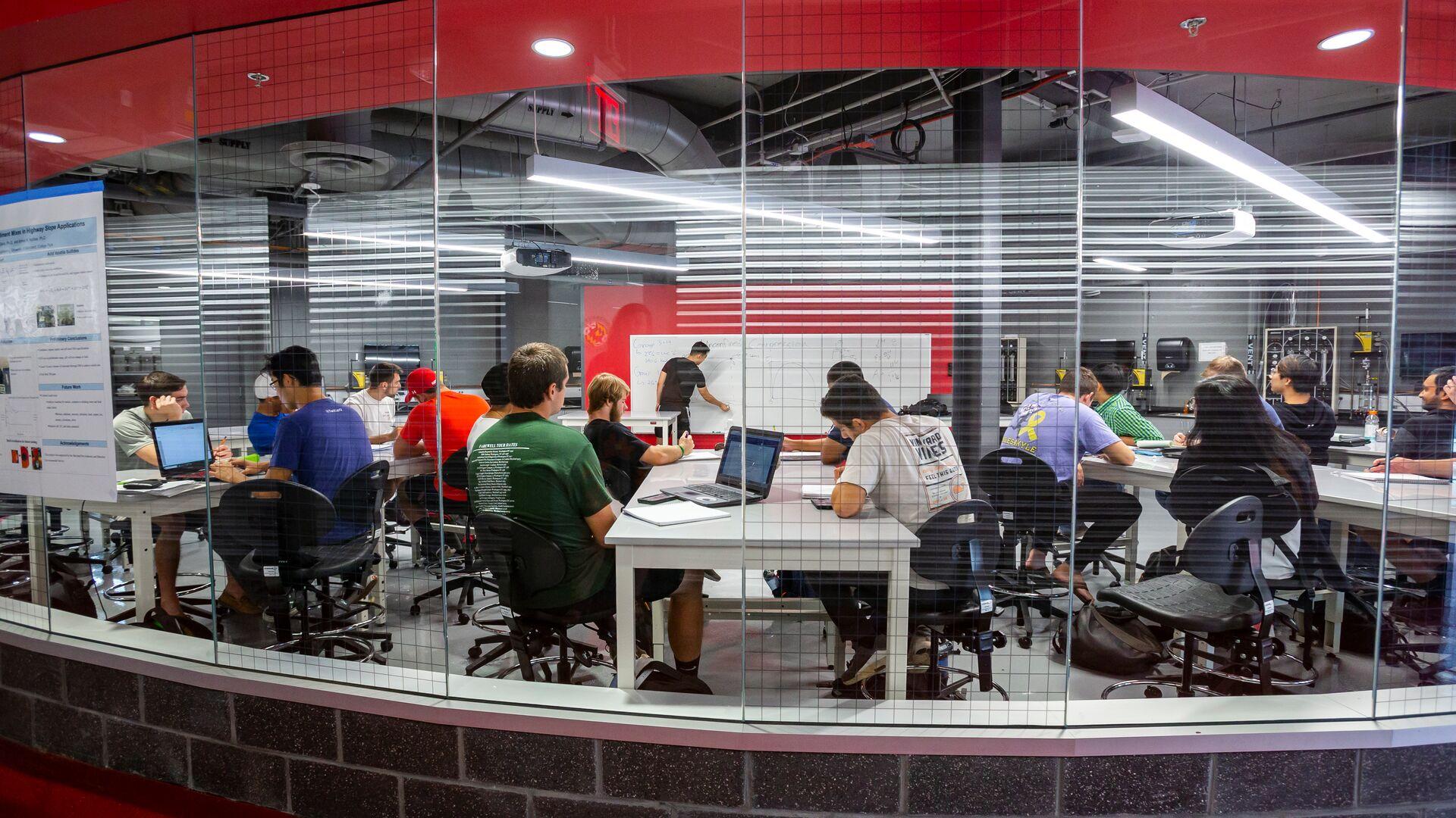
Article titles should follow the University's editorial convention
The body text of an Article Page supports all the same formatting options available in a Text widgdets on other pages including Normal text, Headings 2 through 6, Links, Bold, Italics, Numbered lists, Bulleted lists, Blockquotes, and Images.View Article Details for Article titles should follow the University's editorial convention -
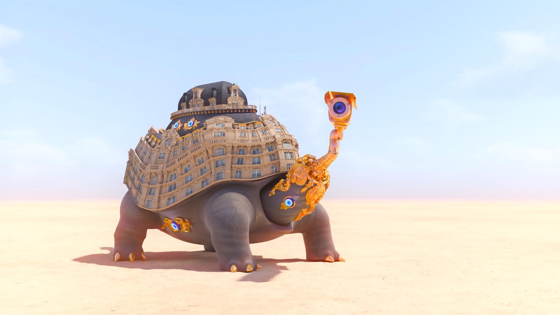
Hitting ‘Play’ at Home
Spoofing our reliance on shopping and technology while omitting any human presence, the enigmatic and boldly animated videos by Jonathan Monaghan MFA ’11 star in a new—and timely—online exhibit at the Art Gallery.View Article Details for Hitting ‘Play’ at Home -

Queen of Costumes
For a costume designer who’s spent her career reflecting the African American experience in film and television, it was an intriguing prospect: envision the look of a futuristic African kingdom that’s rich in vibranium, not to mention helmed by a superhero.View Article Details for Queen of Costumes -
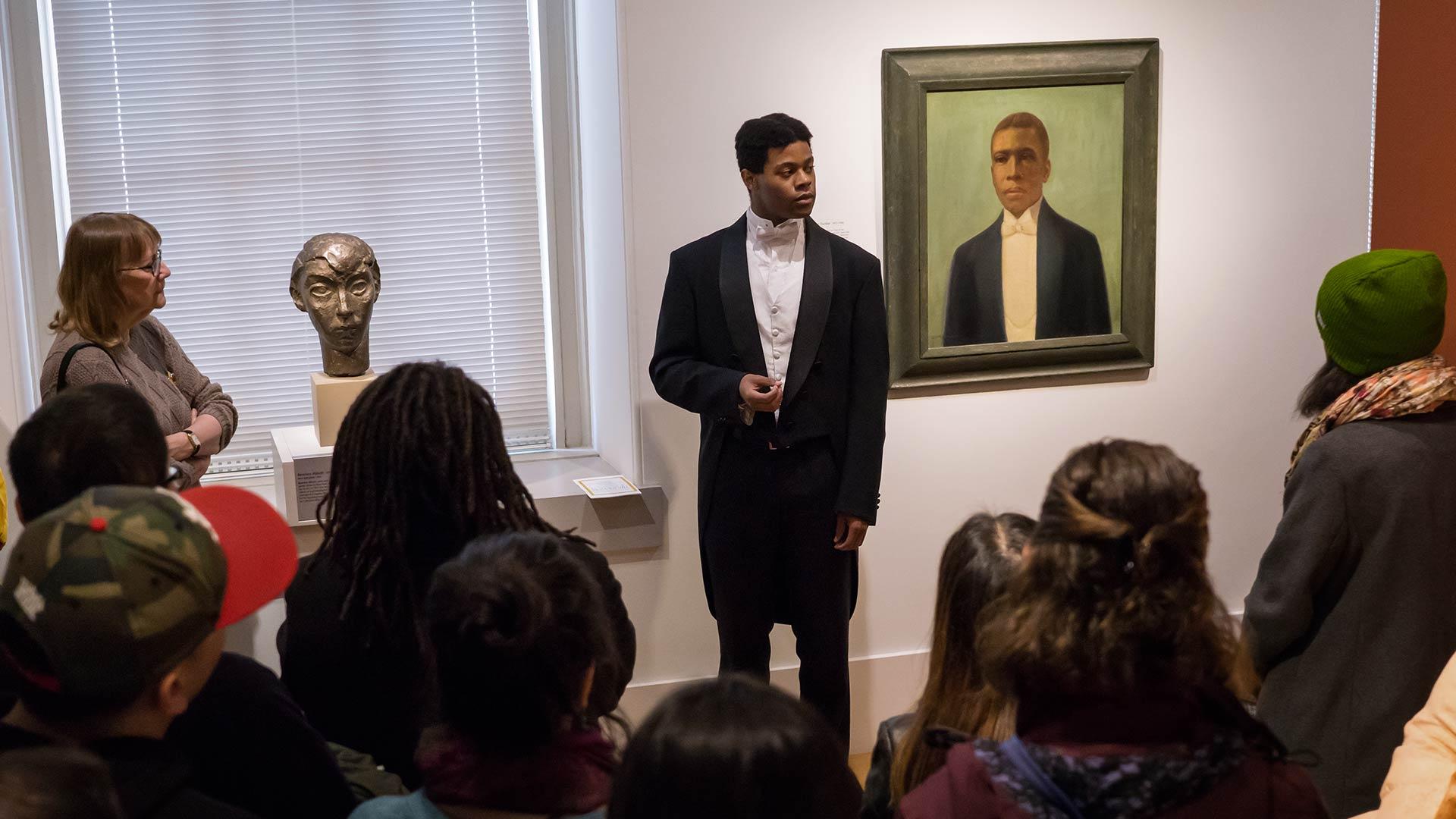
Off the Wall
hough born a century apart, singer Marian Anderson and 18th-century feminist Frances Wright are strolling through the halls of the National Portrait Gallery when suddenly they come across a series of photographs of Anderson. “Marian, this is all you!” cries Wright in her English lilt. Soon, the pair are discussing Anderson’s European travels and Wright’s birthplace across the pond.View Article Details for Off the Wall -
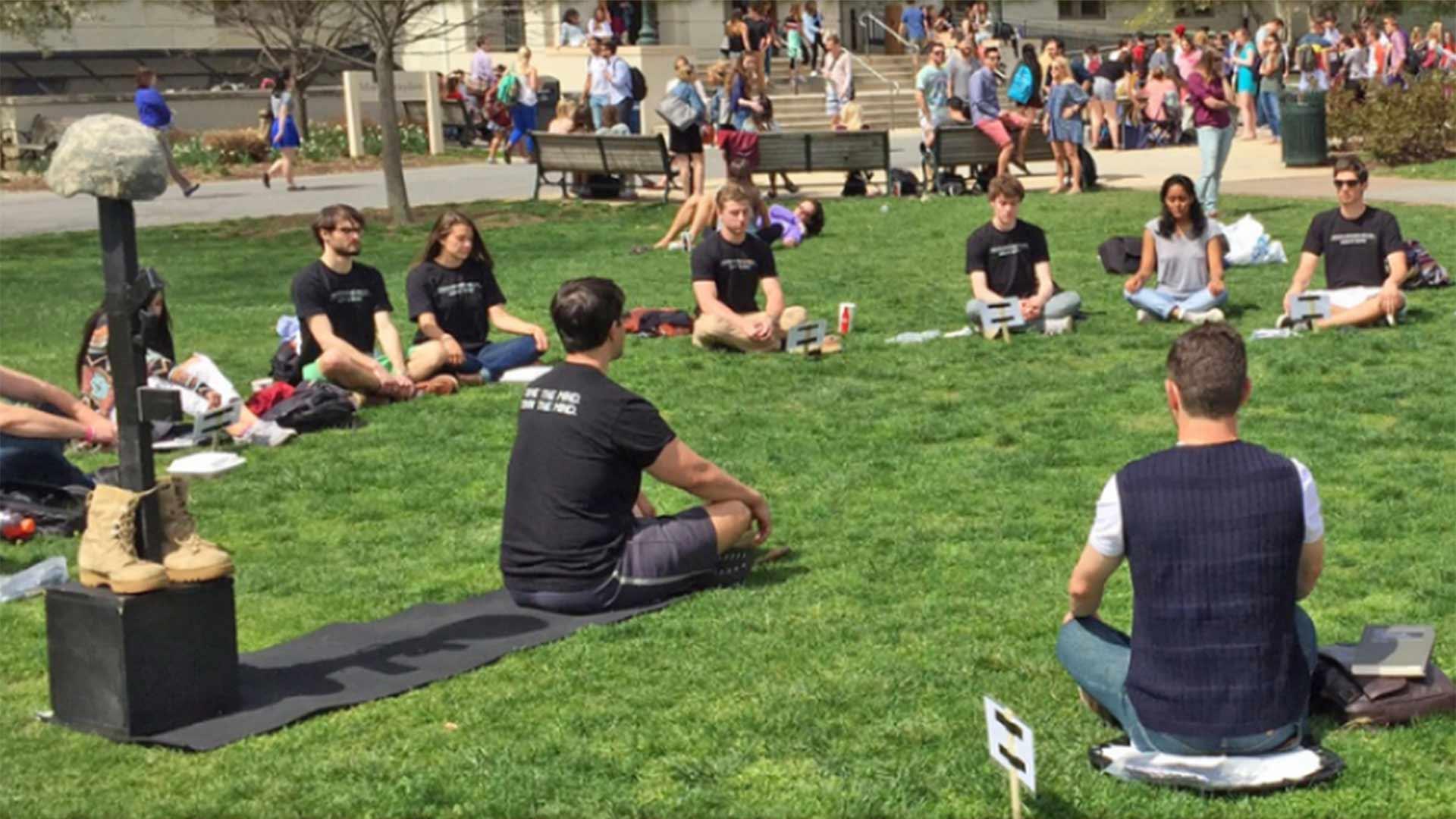
Maryland Today: A Mission to Heal
After serving as an Army psychological operations team leader in Iraq, Ben King quickly learned that what had helped him survive in a war zone wasn’t conducive to thriving in civilian life. “When you’re in a combat environment, mentally it’s just putting the mission first—when it comes to what’s going on for you, it’s very simple: You just disregard it,” King said. Detaching from his internal struggles soon led to drinking to help fall asleep, ignoring physical pain and powering through any emotional turmoil.View Article Details for Maryland Today: A Mission to Heal
Tabs
Keep Tab titles short or they will return to a new line. Each tab includes versions of the Text, Blockquote, Button, Image, and Table section (as well as advanced ones like: Webform, and View).
- Tab Item 1 — Basics: Text
- Tab Item 2 — Intermediate: Blockquotes, Buttons, and Images
- Tab Item 3 — Advanced: Tables, and Views
Text Sections within Tab Items support the same formatting options as self contained Text Sections including Normal text, Headings 2 through 6, Links, Bold, Italics, Numbered lists, Bulleted lists, Blockquotes, and Images.
Filler Text: Id diam maecenas ultricies mi eget mauris pharetra. Volutpat sed cras ornare arcu dui vivamus arcu felis. Amet nisl suscipit adipiscing bibendum est ultricies. Vel pretium lectus quam id leo in. Blandit volutpat maecenas volutpat blandit aliquam etiam erat velit scelerisque. Enim neque volutpat ac tincidunt vitae semper quis lectus nulla.
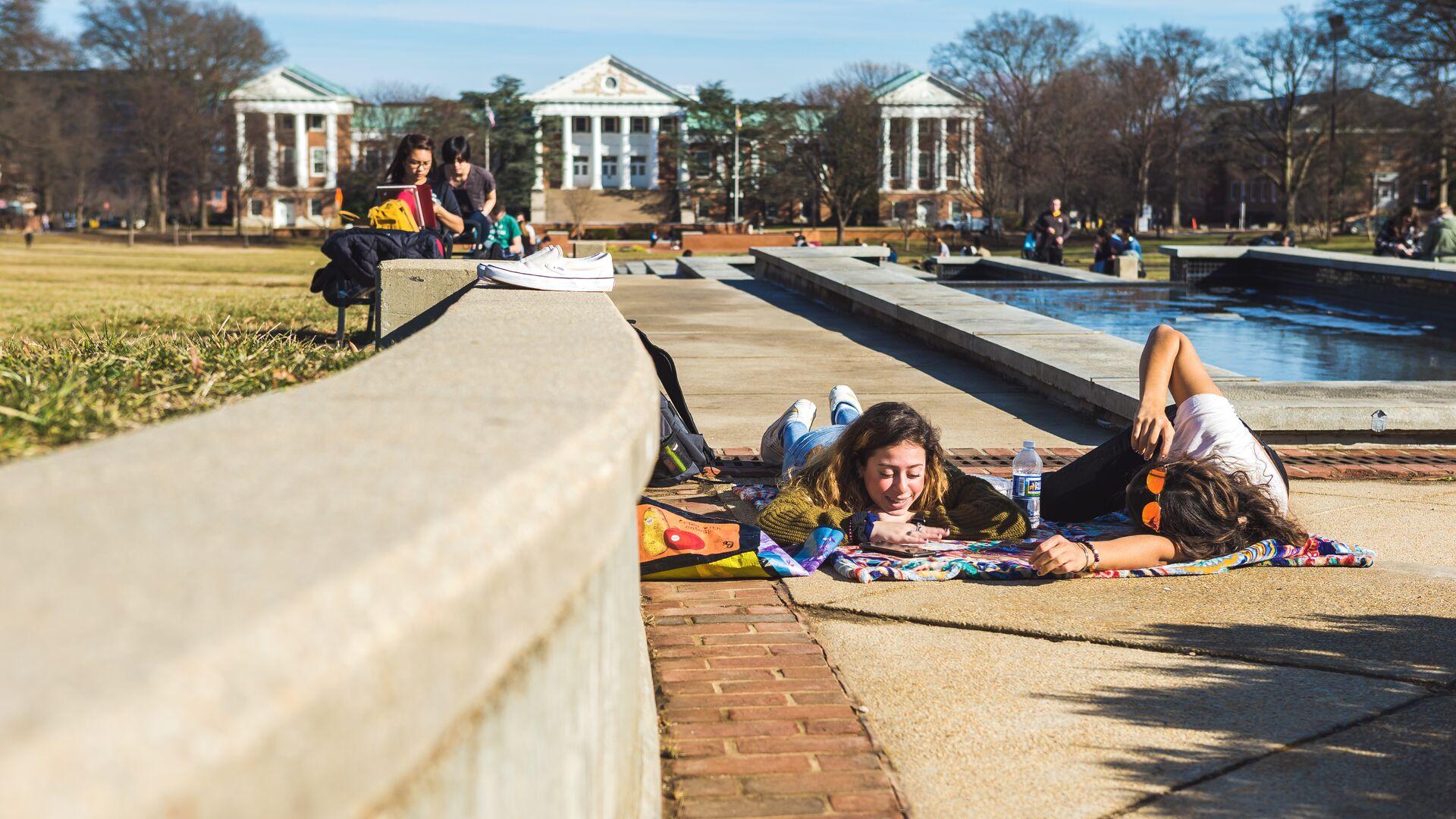
Examples of Buttons, a Blockquotes, and Images

This is a Blockquote, meant for featuring quotes, comments, or messages from experts and other persons of note. Statements like "Fear the Turtle" are great for the Blockquote Section.
Digital Experience Team
Examples of a Table, and a view (Article feed).
| Header 1 (Row 1), Column 1 | Header 1 (Row 1), Column 2 |
|---|---|
| Row 2, Column 1 | Row 2, Column 2 |
| Row 3, Column 1: Eu consequat ac felis donec et odio pellentesque. Aliquam nulla facilisi cras fermentum odio eu feugiat. Ut tellus elementum sagittis vitae et leo duis. Nibh praesent tristique magna sit amet purus gravida. | Row 3, Column 2: Laoreet id donec ultrices tincidunt arcu. Eget duis at tellus at urna condimentum. Et netus et malesuada fames. Ultricies mi eget mauris pharetra. Vestibulum rhoncus est pellentesque elit ullamcorper. |
Latest News
-

Article titles should follow the University's editorial convention
The body text of an Article Page supports all the same formatting options available in a Text widgdets on other pages including Normal text, Headings 2 through 6, Links, Bold, Italics, Numbered lists, Bulleted lists, Blockquotes, and Images.View Article Details for Article titles should follow the University's editorial convention -

Hitting ‘Play’ at Home
Spoofing our reliance on shopping and technology while omitting any human presence, the enigmatic and boldly animated videos by Jonathan Monaghan MFA ’11 star in a new—and timely—online exhibit at the Art Gallery.View Article Details for Hitting ‘Play’ at Home -

Queen of Costumes
For a costume designer who’s spent her career reflecting the African American experience in film and television, it was an intriguing prospect: envision the look of a futuristic African kingdom that’s rich in vibranium, not to mention helmed by a superhero.View Article Details for Queen of Costumes -

Off the Wall
hough born a century apart, singer Marian Anderson and 18th-century feminist Frances Wright are strolling through the halls of the National Portrait Gallery when suddenly they come across a series of photographs of Anderson. “Marian, this is all you!” cries Wright in her English lilt. Soon, the pair are discussing Anderson’s European travels and Wright’s birthplace across the pond.View Article Details for Off the Wall -

Maryland Today: A Mission to Heal
After serving as an Army psychological operations team leader in Iraq, Ben King quickly learned that what had helped him survive in a war zone wasn’t conducive to thriving in civilian life. “When you’re in a combat environment, mentally it’s just putting the mission first—when it comes to what’s going on for you, it’s very simple: You just disregard it,” King said. Detaching from his internal struggles soon led to drinking to help fall asleep, ignoring physical pain and powering through any emotional turmoil.View Article Details for Maryland Today: A Mission to Heal

This is a Blockquote, meant for featuring quotes, comments, or messages from experts and other persons of note. Statements like "Fear the Turtle" are great for the Blockquote Widget.
Digital Experience Team
Office of Strategic Communications

This is a Blockquote, meant for featuring quotes, comments, or messages from experts and other persons of note. Statements like "Fear the Turtle" are great for the Blockquote Widget.
Digital Experience Team
Office of Strategic Communications
Stat Groups
Share quick, key numbers about the school, department, or office
Guidelines for Stat Group Widgets
Tables (Light and Dark)
Tables can be added manually or automatically filled in from an uploaded .csv file. Cells expand horizontally based on the number of columns, and vertically based on the length of the content. Tables have an optimized view for smaller screens.
| header 1 (Row 1): Column 1 | header 1 (Row 1): Column 2 | header 1 (Row 1): Column 3 |
|---|---|---|
| Row 2: Column 1 | Row 2: Column 2 | Row 2: Column 3 |
| Row 3: Column 1 | Row 3: Column 2 | Row 3: Column 3 |
| Row 4: Column 1 | Row 4: Column 2 | Row 4: Column 3 |
| Row 5: Column 1: Urna neque viverra justo nec ultrices. Vel turpis nunc eget lorem dolor sed viverra ipsum. Justo nec ultrices dui sapien eget mi. Viverra aliquet eget sit amet tellus cras adipiscing enim eu. Eget nulla facilisi etiam dignissim diam quis enim. | Row 5: Column 2: Eu consequat ac felis donec et odio pellentesque. Aliquam nulla facilisi cras fermentum odio eu feugiat. Ut tellus elementum sagittis vitae et leo duis. Nibh praesent tristique magna sit amet purus gravida. | Row 5: Column 3: Laoreet id donec ultrices tincidunt arcu. Eget duis at tellus at urna condimentum. Et netus et malesuada fames. Ultricies mi eget mauris pharetra. Vestibulum rhoncus est pellentesque elit ullamcorper. |
Buttons and Link Sets
Buttons sets have the same style options as those found in bootstrap, The main two used at UMD are Primary, and Secondary. Whether using Button or Link Sets, it is advised to keep titles short, though Link Sets can support slightly longer titles as they appear in a vertical list.
Guidelines for Button Set Widgets
Guidelines for Link Set Widgets
Card Groups (Light and Dark)
Card examples with or without images, and with or without links.
Guidelines for Card Group Widgets

Card title, keep it catchy, keep it short
Text areas support a number of formats by default with "Basic HTML" text formatting including Normal text, Headings 2 through 6, Links, Bold, Italics, Numbered lists, Bulleted lists, Blockquotes, and Images.
Card groups help break up related content into manageable chunks for easier understanding, or as a teaser for longer articles/pages.

Cards do not need to include links
Cards without a link do not behave interactively (no hover effects). As mentioned in the previously, Card Groups provide another way to present information with or without an accompanying image for each card.
Like with the card's title, keep the content in text areas short; no more than a couple of short paragraphs. If this card links to a page or article, think of this space as the summary to that page or that article.
Notice this link is within the body text of the card, and does not cause the whole card to become interactive (no hover effect).
Cards can be presented with and without images
Without an image, cards still fill the full height of the space they occupy. If the card has a link, it will still behave interactively with a hover effect.
Filler text: Suspendisse faucibus interdum posuere lorem ipsum dolor sit amet consectetur. Tincidunt augue interdum velit euismod. Non tellus orci ac auctor augue. Feugiat nisl pretium fusce id. Nulla facilisi cras fermentum odio eu feugiat pretium.

Card title, keep it catchy, keep it short
Text areas support a number of formats by default with "Basic HTML" text formatting including Normal text, Headings 2 through 6, Links, Bold, Italics, Numbered lists, Bulleted lists, Blockquotes, and Images.
Card groups help break up related content into manageable chunks for easier understanding, or as a teaser for longer articles/pages.

Cards do not need to include links
Cards without a link do not behave interactively (no hover effects). As mentioned in the previously, Card Groups provide another way to present information with or without an accompanying image for each card.
Like with the card's title, keep the content in text areas short; no more than a couple of short paragraphs. If this card links to a page or article, think of this space as the summary to that page or that article.
Notice this link is within the body text of the card, and does not cause the whole card to become interactive (no hover effect).
Cards can be presented with and without images
Without an image, cards still fill the full height of the space they occupy. If the card has a link, it will still behave interactively with a hover effect.
Filler text: Suspendisse faucibus interdum posuere lorem ipsum dolor sit amet consectetur. Tincidunt augue interdum velit euismod. Non tellus orci ac auctor augue. Feugiat nisl pretium fusce id. Nulla facilisi cras fermentum odio eu feugiat pretium.
Image (Light and Dark)
The Image Section offers space for a single image that take up the entire width of content on the page. Make sure images are large enough.


Image with Text (Left and Right Aligned)
While text sections support the addition of images, there is a separate "Image with Text" section. Each section supports one image along with a text area. Images can be aligned left or right. Images are pulled from the site's media library (accessible on the admin panel), so you can include images that have been previously uploaded, as well as newly uploaded images. Descriptive "alt-text" is required on each image during the upload process.
Guidelines for Image with Text Widgets

Text areas support a number of formats by default with "Basic HTML" text formatting including Normal text, Headings 2 through 6, Links, Bold, Italics, Numbered lists, Bulleted lists, Blockquotes, and Images.
Filler text: Bibendum enim facilisis gravida neque convallis. Erat imperdiet sed euismod nisi porta lorem. Elit sed vulputate mi sit amet mauris. Ut aliquam purus sit amet luctus venenatis lectus magna. Blandit turpis cursus in hac habitasse. Sollicitudin tempor id eu nisl nunc mi ipsum. Facilisi morbi tempus iaculis urna id. Bibendum at varius vel pharetra vel turpis nunc. Semper risus in hendrerit gravida rutrum quisque. Etiam dignissim diam quis enim. Blandit turpis cursus in hac habitasse platea dictumst quisque. Vel pharetra vel turpis nunc eget. Cursus metus aliquam eleifend mi in. Eleifend mi in nulla posuere sollicitudin aliquam ultrices sagittis orci. Duis at tellus at urna. Aliquam vestibulum morbi blandit cursus risus at.
Carousel (Light and Dark)
Carousels have the same options as Slideshows, with one key difference. They take up less space on the page, and instead open to take up the whole screen when clicked.
Guidelines for Carousel Widgets


Slideshows (Light and Dark)
The first slideshow uses the light theme, and offers 5 examples of slides in varying configurations.
Guidelines for Slideshow Widgets
Video (Light and Dark)
The video section supports videos published to youtube. Follow the "Video Content Tips" on the Admin Panel to properly embed the video.
Event and News Feeds
Event feeds and News feeds are populated from content stored in the universities hub (hub.umd.edu), which is managed by the Office of Strategic Communications. Both feeds use a modified version of the Card Group Section to display content.
Guidelines for News Feed Widgets
Guidelines for Event Feed Widgets
Arts News From Maryland Today - Light Theme
Sorry, no news articles available.
Arts News From Maryland Today - Dark Theme
Sorry, no news articles available.
Events featured on Maryland Today - Light Theme
Sorry, no upcoming UMD events available.
Latest Athletic and Recreation Events - Dark Theme
Sorry, no upcoming UMD events available.
Views (Local Article and Local Event Feeds)
Views are an advanced feature of Drupal sites that allow a site administrator to automatically add content to a section or page based on certain parameters. Here we use it to list any pages created using the UMD Terp Article layout to create a "news feed" of Articles. Learn More about Articles. Below the Article "news feed" is a list of pages created using the UMD Terp Event layout to create a "news feed" of local Events. Learn More about Events.
Latest News
-

Article titles should follow the University's editorial convention
The body text of an Article Page supports all the same formatting options available in a Text widgdets on other pages including Normal text, Headings 2 through 6, Links, Bold, Italics, Numbered lists, Bulleted lists, Blockquotes, and Images.View Article Details for Article titles should follow the University's editorial convention -

Hitting ‘Play’ at Home
Spoofing our reliance on shopping and technology while omitting any human presence, the enigmatic and boldly animated videos by Jonathan Monaghan MFA ’11 star in a new—and timely—online exhibit at the Art Gallery.View Article Details for Hitting ‘Play’ at Home -

Queen of Costumes
For a costume designer who’s spent her career reflecting the African American experience in film and television, it was an intriguing prospect: envision the look of a futuristic African kingdom that’s rich in vibranium, not to mention helmed by a superhero.View Article Details for Queen of Costumes -

Off the Wall
hough born a century apart, singer Marian Anderson and 18th-century feminist Frances Wright are strolling through the halls of the National Portrait Gallery when suddenly they come across a series of photographs of Anderson. “Marian, this is all you!” cries Wright in her English lilt. Soon, the pair are discussing Anderson’s European travels and Wright’s birthplace across the pond.View Article Details for Off the Wall -

Maryland Today: A Mission to Heal
After serving as an Army psychological operations team leader in Iraq, Ben King quickly learned that what had helped him survive in a war zone wasn’t conducive to thriving in civilian life. “When you’re in a combat environment, mentally it’s just putting the mission first—when it comes to what’s going on for you, it’s very simple: You just disregard it,” King said. Detaching from his internal struggles soon led to drinking to help fall asleep, ignoring physical pain and powering through any emotional turmoil.View Article Details for Maryland Today: A Mission to Heal
Upcoming Events
-
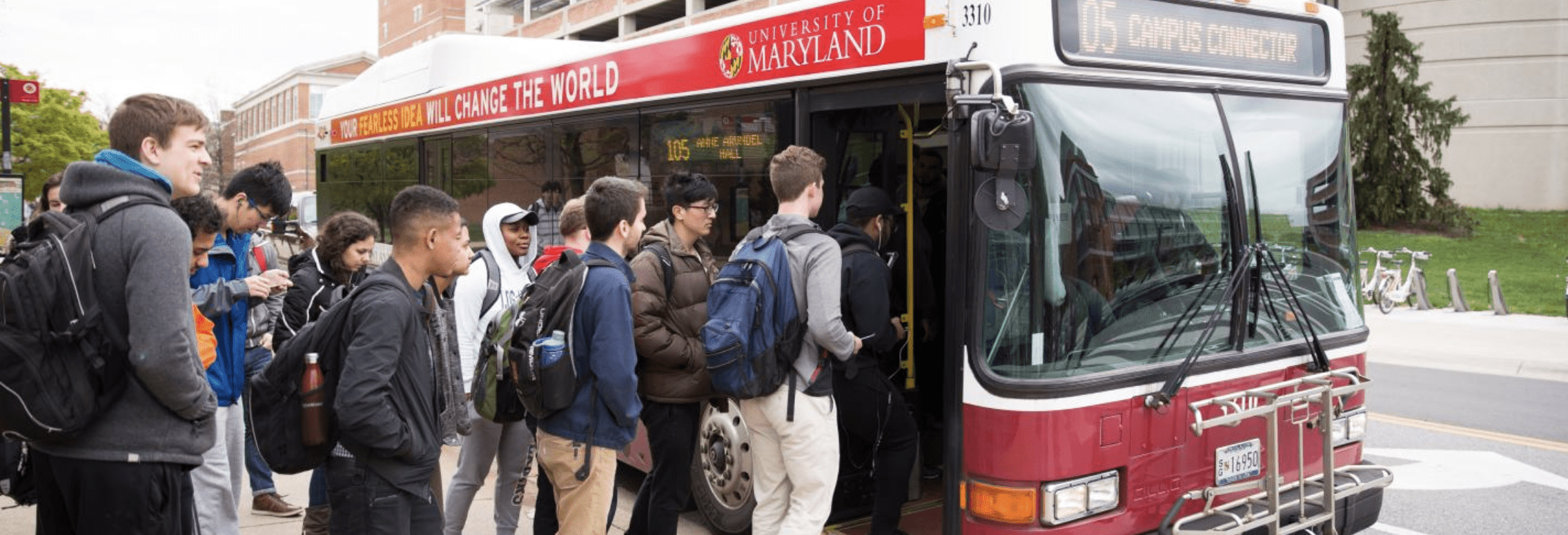
Graduation Party
Join us as we celebrate this year's graduates!June 12, 2026June 12, 2026View Event Details for Graduation Party -

Stargazing
Made in the interiors of collapsing stars dispassionate extraterrestrial observer white dwarf rings of Uranus rich in mystery the sky calls to us?August 8, 2026August 8, 2026View Event Details for Stargazing -
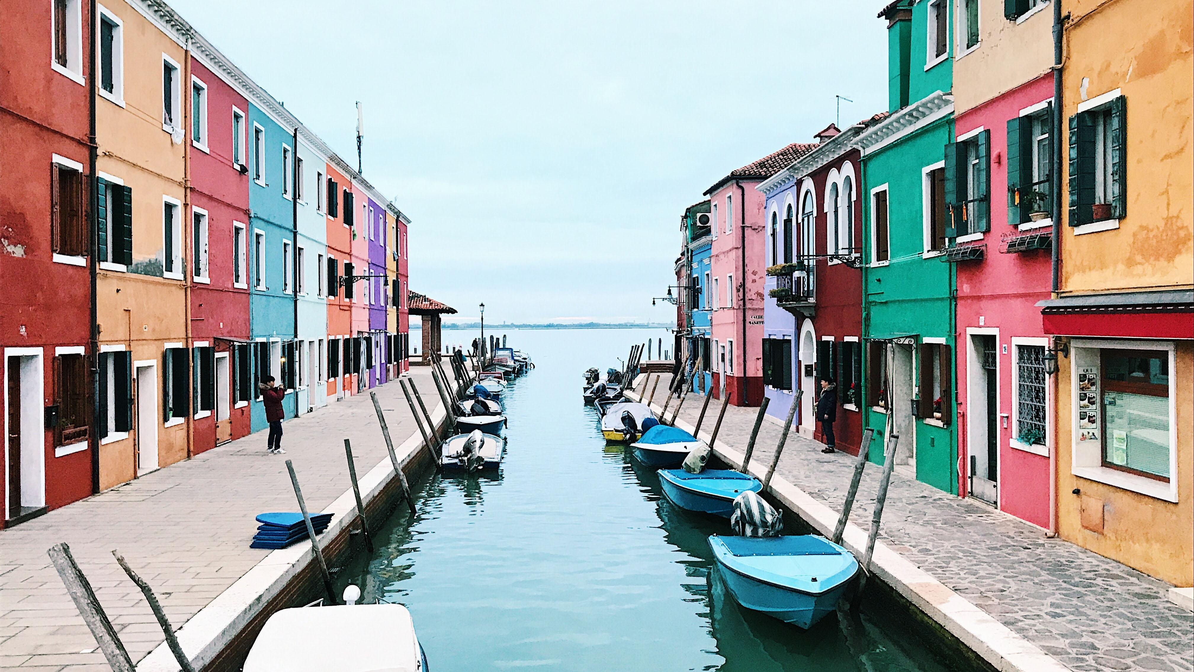
Home Movies Screening
Fun time to be had by all.December 22, 2026December 22, 2026View Event Details for Home Movies Screening
People
The "People" section is the same found on the directory page and employs a manual ordering system.

Jane Smith
Director

John Doe
Example Title
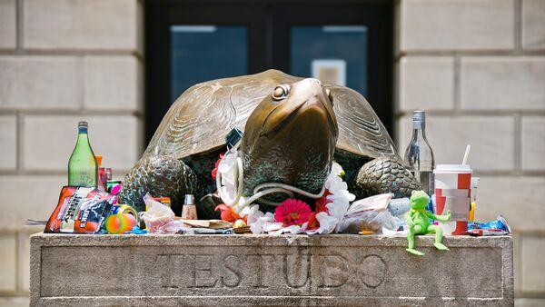
Testudo
School Mascot
Dividers
Dividers have two (2) options to set, Spacing above and below the divider, and the Rule (i.e. the thickness of the dividing line.
- Spacing Options: None (no extra spacing), Small (2rem), Medium (2.5rem), Large (3.25rem), XLarge (4rem)
- Rule Options: None (0px), Small (1px), Medium (3px), Large (5px), and XLarge (8px)
Webform - ADVANCED FEATURE
The Webform widget will display an online form created through Drupal's own webform tools. Data submitted to this form is either emailed to a specified address, or saved to the site's database. Webforms are considered an advanced feature of Drupal sites. Only experienced developers knowledgable with Drupal's webform features should implement them on a site. Learn more about the webform module on drupal.com. As forms are a useful tool in collecting user information, care must be taken when accepting user data, and must adhere to University Policy.
Guidelines for Webform Widgets
The form below was created as an example. Any submissions to the form below will not be saved.
Survey
Template Customization
The UMD Drupal Templates, This Demo site, and The Starter site are designed to align with University branding (color, layout, typography, etc) and accessibility policies. If you have Drupal development experience and wish to customize these template or your site beyond options covered in the template guidelines, modifications must align to those policies. Details can be found on the University of Maryland Brand Toolkit, and the University of Maryland Web Accessibility Policy (pdf).
Learn More
The Template guidelines will share both steps to set up and maintain a Drupal site, as well as best practices for doing so.
Contact
Most questions related the UMD Drupal Theme and Templates should be addressed in the Template Guidelines, in various pages on this site or this Kitchen Sink page. If you still have questions, contact the DIT Drupal Team.
