Feature (UMD Terp Homepage only)
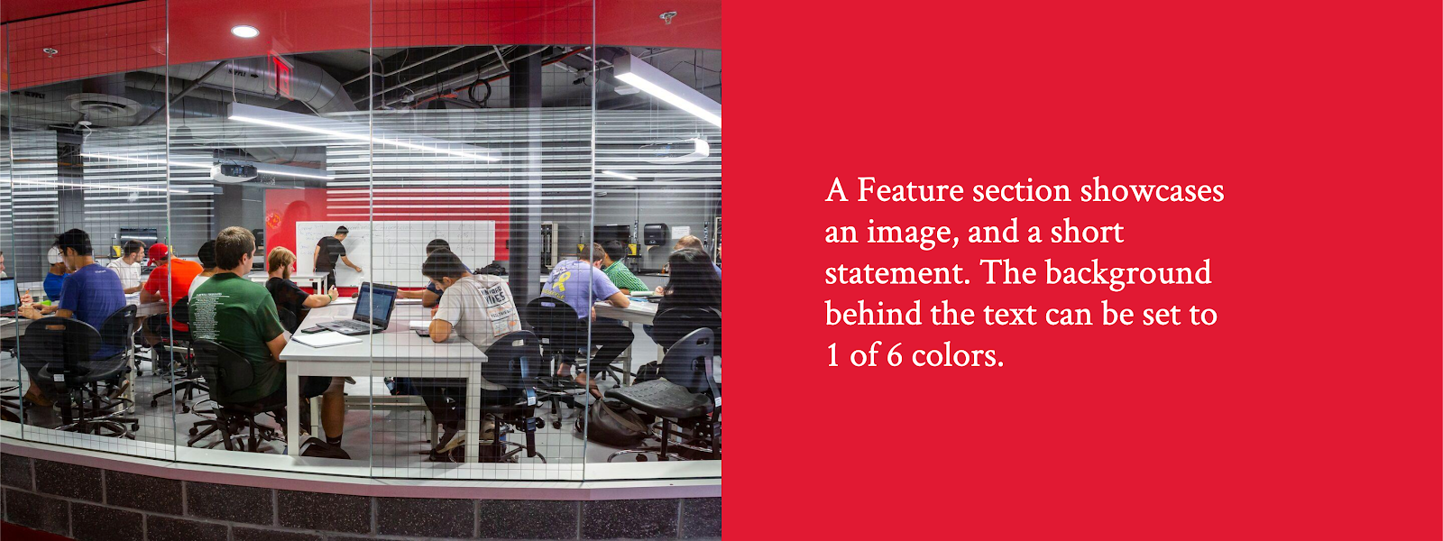
The UMD Terp Homepage supports all the same widgets described in these guidelines, as well as this extra widget called Feature. The Feature widget is an image to one side, with text and/or a button inside a box, that can be set to one of 6 different colors. The Feature widget works best when used with 2 or 3 of them stacked right after the other, reversing every other instance. On smaller screens the photo will appear either above or below the block of text depending on the options selected.
Front-end View (What it looks like)
Feature widget Options
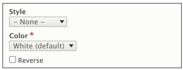
- Style: None/Default, and Background. Setting the style to “Background” will stretch the image to take up the full width of the site.
- Color: Select one of 6 colors based on UMD branding (White/Default, Light Gray, Gray, Red, Dark Red, Yellow, Black).
- Alignment: A Checkbox to reverse the feature’s orientation to have the text content on the left, and the image on the right on larger screens.
Adding an Image to the Feature Widget
- The Feature widget is designed to include an image that appears by default to the left of the text content on larger screens, and above on smaller screens. Follow Image size recommendations when selecting an image.
- Click the “Add Media” button.
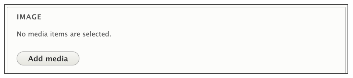
- Select a previously uploaded image from the media library, or follow the same instructions for uploading images, Starting at step 5.
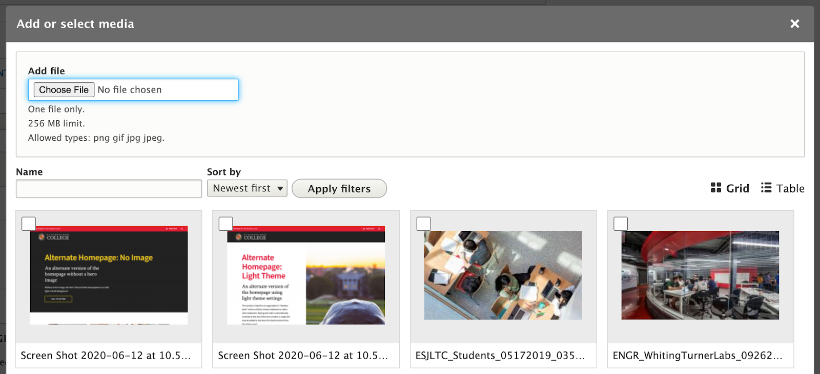
- Reusability: New images will be available for reuse in the media library after upload. You can choose to upload a new image, or select an image from that library.
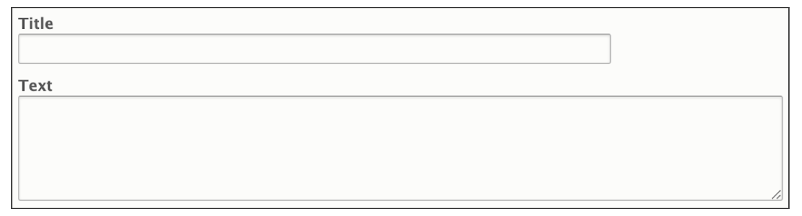
Feature Widget Fields
- Title: Large formatted text to catch the user’s attention
- Text: Standard sized text for sentence or two.
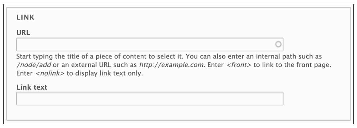
- Link: A link, styled similar to the Hero Section’s Call to Action button.
- URL: The URL is the technical term for the web address your Link points to. If you are linking to another page on your site, you don’t need to know the exact address, just the name of the page. If you are linking to a different site (like the University’s Giving site), be sure to include “https://” at the beginning of the address if it isn’t already.
- Link Text: Link Text is the text that will appear inside the button. While the button will display up to 120 characters before truncating it, try to keep link text short to a few words, and with a clear message.