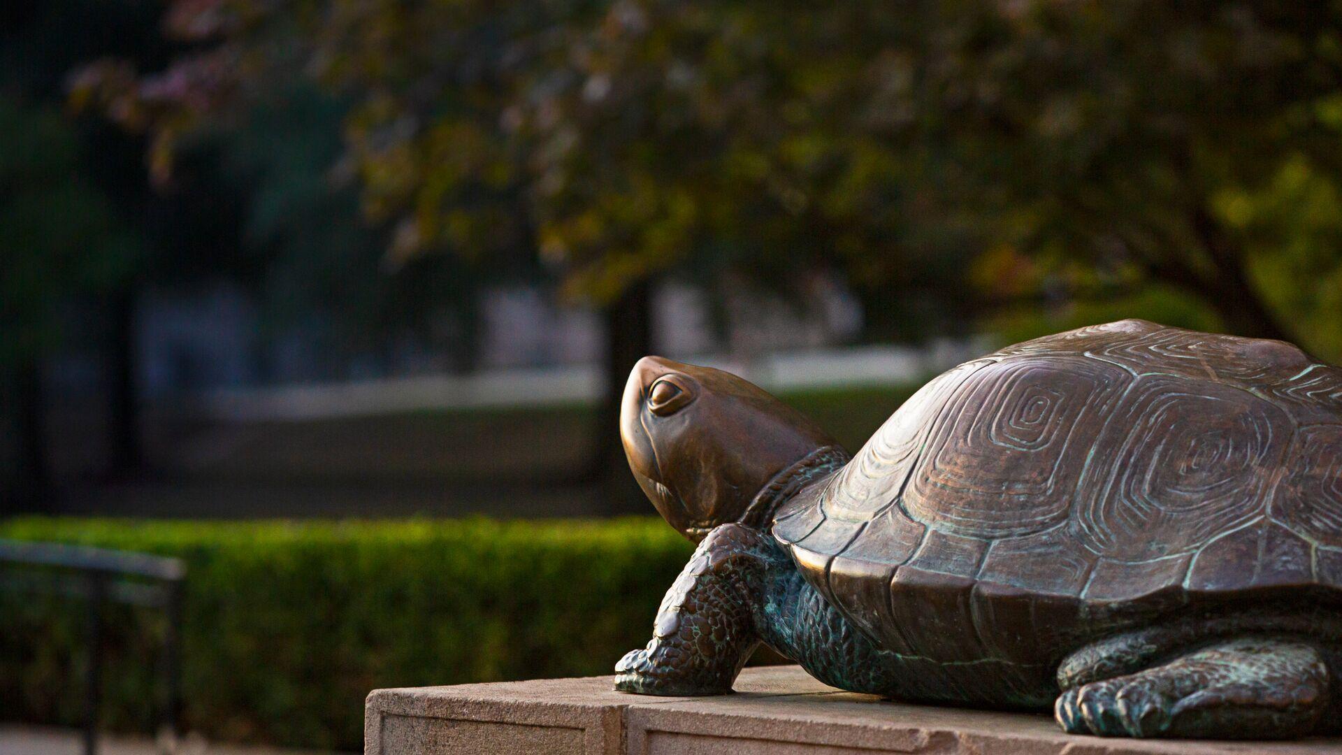
UMD Drupal Theme
This template is available for campus websites and can be requested through the Division of IT. Use this site as a guide on all the features available in the template.
Layouts and Resources
This demo site showcases the features made available by the UMD Drupal Templates, and how they may benefit you and your unit. You can, Get started with a few key features, Deep dive into the Guidelines, View examples on the kitchen sink, or Find inspiration from existing sites.
Getting Started
Use the following information to assist in the set-up and configuration your UMD Terp themed site.
Template Guidelines
The UMD Terp Theme (sometimes called Drupal 8 Templates, UMD Templates or just the “Templates”) is the Drupal theme for all UMD drupal 8 based websites.
Kitchen Sink
Examples and best practices for all the widgets and features made available by the UMD Drupal Templates.
Find Inspiration
A collection of sites created using the UMD Drupal Templates.
Homepage Layouts
The UMD Terp Homepage is meant for a site's home or landing page, but the layout can be placed anywhere on the site. As such, the Homepage layout is also useful for self contained projects that exist under a School's, Department's, or Unit's site.
Articles
Your organization might differentiate between "blog posts", "statements", "press releases", or many other types of editorial content. The UMD Terp Theme simplifies all this by calling them all "articles" using the UMD Terp Article layout.
People
The UMD Terp Person provides space to share or promote important information for individuals in your school, department or unit.
Basic Pages
The UMD Terp Basic Page is great for sharing more in-depth information about an organization (About page, Resources pages, Photo Gallery pages, etc). View examples of the Basic Page being used for the site's News feed, Directory, and an Internal page of resources.
Short Eye-catching Alert Title
Short Subtitle
While Alert text areas support the same formatting as standard text widgets, it is best to keep the text here short, and link to another page where you can put lengthy details.
Card Groups

Card title, keep it catchy, keep it short
Text areas support a number of formats by default with "Basic HTML" text formatting including Normal text, Headings 2 through 6, Links, Bold, Italics, Numbered lists, Bulleted lists, Blockquotes, and Images.
Card groups help break up related content into manageable chunks for easier understanding, or as a teaser for longer articles/pages.
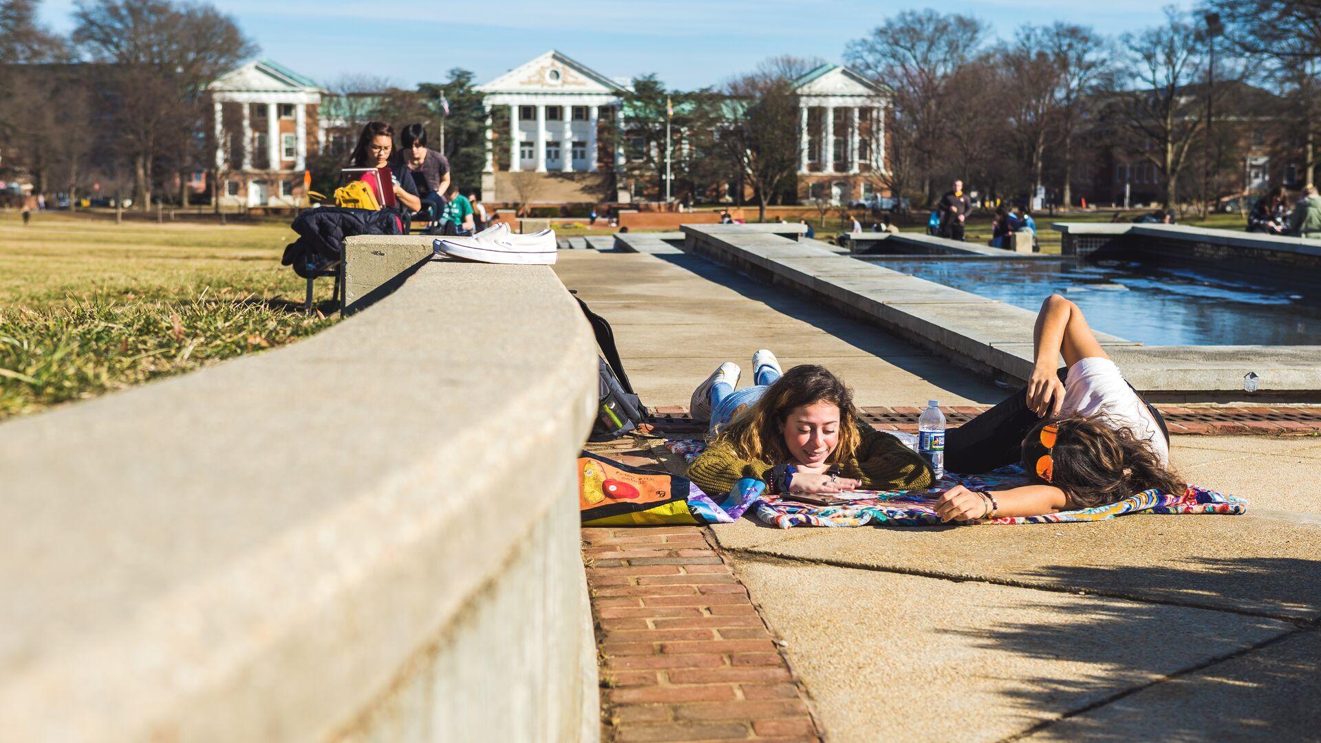
Cards do not need to include links
As mentioned in the previously, Card Groups provide another way to present information with or without an accompanying image for each card.
Like with the card's title, keep the content in text areas short; no more than a couple of short paragraphs. If this card links to a page or article, think of this space as the summary to that page or that article.
Cards can be presented with and without images
Without an image, cards still fill the full height of the space they occupy. If the card has a link, it will still behave interactively with a hover effect.
Filler text: Suspendisse faucibus interdum posuere lorem ipsum dolor sit amet consectetur. Tincidunt augue interdum velit euismod. Non tellus orci ac auctor augue. Feugiat nisl pretium fusce id. Nulla facilisi cras fermentum odio eu feugiat pretium.
Button Sets
Feature Widgets
Feature Widgets are exclusive to the UMD Terp Homepage layout.
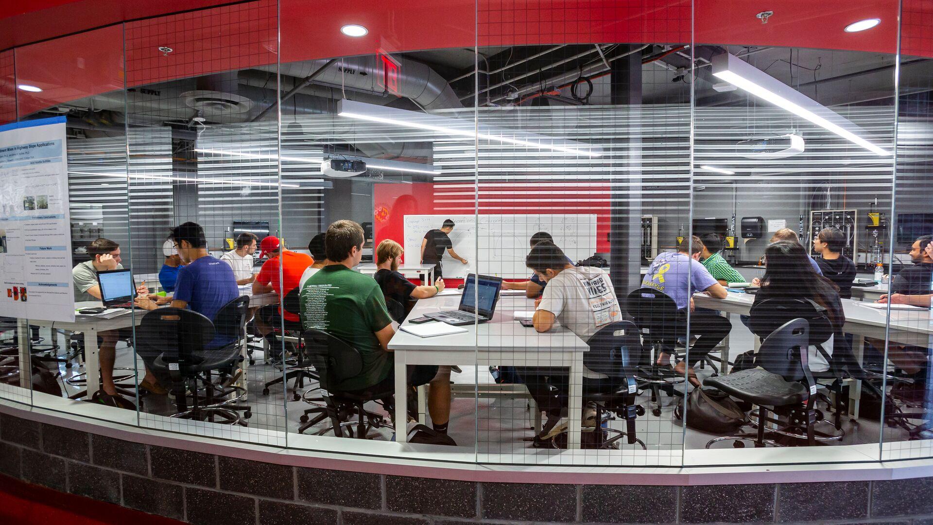
A Feature widget showcases an image, and a panel of text
Text options include a Title, Body of Text, and a link that appears as a button.
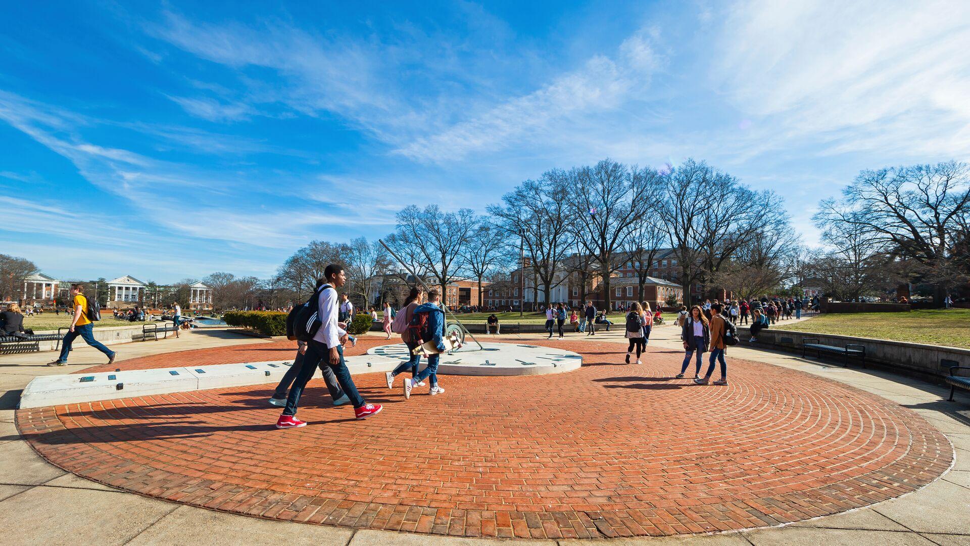
Reverse
Each Feature is a separate widget on the admin panel. Text can be set on the right or left (reverse) like this one.
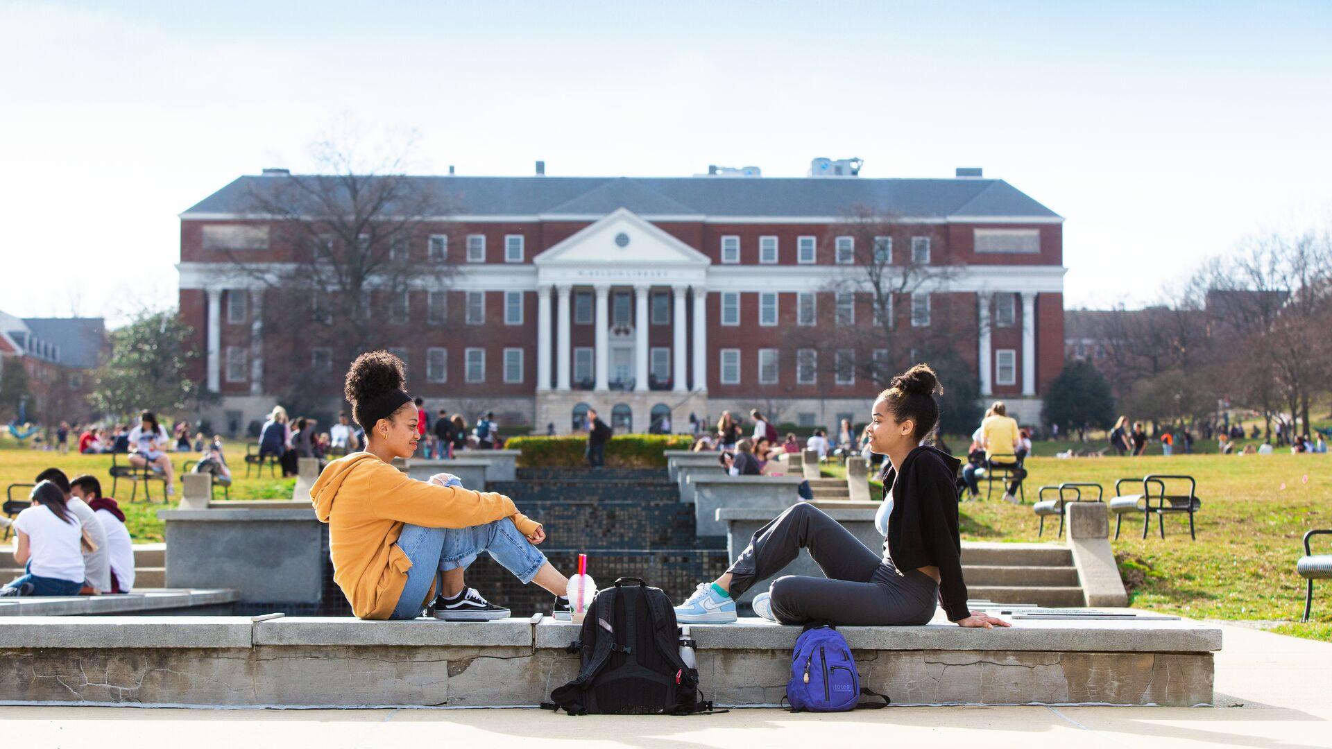
Feature widgets are unique to the UMD Terp Homepage
Images are added from the media gallery. Recommendations for using the best image possible can be found in the template guidelines.

Image with Text Widget
This widget is called "Image with Text", and each one supports an image along with a text area. Images can be aligned left or right, and are pulled from the site's media library (accessible on the admin panel), so you can include images that have been previously uploaded, as well as newly uploaded images. Descriptive "alt-text" is required on each image during the upload process.
Text areas support a number of formats by default with "Basic HTML" text formatting including Normal text, Headings 2 through 6, Links, Bold, Italics, Numbered lists, Bulleted lists, Blockquotes, and Images.
Filler text: Bibendum enim facilisis gravida neque convallis. Erat imperdiet sed euismod nisi porta lorem. Elit sed vulputate mi sit amet mauris. Ut aliquam purus sit amet luctus venenatis lectus magna. Blandit turpis cursus in hac habitasse. Sollicitudin tempor id eu nisl nunc mi ipsum. Facilisi morbi tempus iaculis urna id. Bibendum at varius vel pharetra vel turpis nunc. Semper risus in hendrerit gravida rutrum quisque. Etiam dignissim diam quis enim. Blandit turpis cursus in hac habitasse platea dictumst quisque. Vel pharetra vel turpis nunc eget. Cursus metus aliquam eleifend mi in. Eleifend mi in nulla posuere sollicitudin aliquam ultrices sagittis orci. Duis at tellus at urna. Aliquam vestibulum morbi blandit cursus risus at.
Stat Group
Blockquote

This is a Blockquote, meant for featuring quotes, comments, or messages from experts and other persons of note. Statements like "Fear the Turtle" are great for the Blockquote widget.
Digital Experience
Office of Strategic Communications
News Feed Widget pulling in Articles from Maryland Today

Get the Hang of UMD’s Commencement Cords

Excellence in Supervision Program Helps UMD Supervisors Build Stronger Teams

Digital Revival of a Displaced Community
View Widget displaying the latest (local) Articles
-

Article titles should follow the University's editorial convention
The body text of an Article Page supports all the same formatting options available in a Text widgdets on other pages including Normal text, Headings 2 through 6, Links, Bold, Italics, Numbered lists, Bulleted lists, Blockquotes, and Images.View Article Details for Article titles should follow the University's editorial convention -
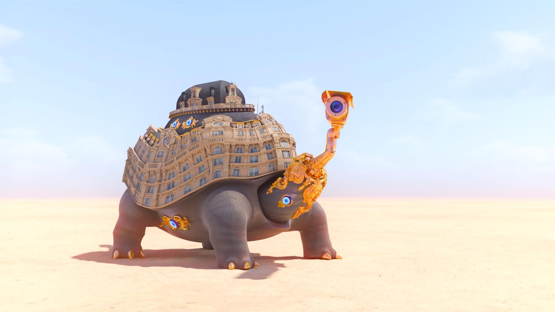
Hitting ‘Play’ at Home
Spoofing our reliance on shopping and technology while omitting any human presence, the enigmatic and boldly animated videos by Jonathan Monaghan MFA ’11 star in a new—and timely—online exhibit at the Art Gallery.View Article Details for Hitting ‘Play’ at Home -

Queen of Costumes
For a costume designer who’s spent her career reflecting the African American experience in film and television, it was an intriguing prospect: envision the look of a futuristic African kingdom that’s rich in vibranium, not to mention helmed by a superhero.View Article Details for Queen of Costumes -
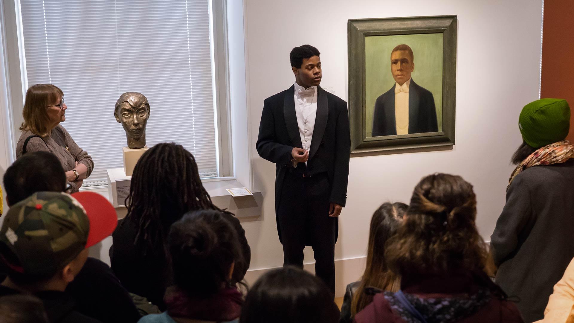
Off the Wall
hough born a century apart, singer Marian Anderson and 18th-century feminist Frances Wright are strolling through the halls of the National Portrait Gallery when suddenly they come across a series of photographs of Anderson. “Marian, this is all you!” cries Wright in her English lilt. Soon, the pair are discussing Anderson’s European travels and Wright’s birthplace across the pond.View Article Details for Off the Wall -
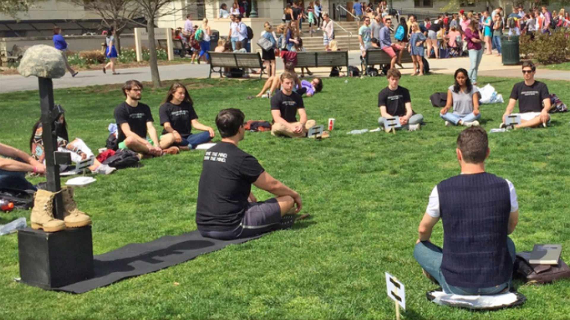
Maryland Today: A Mission to Heal
After serving as an Army psychological operations team leader in Iraq, Ben King quickly learned that what had helped him survive in a war zone wasn’t conducive to thriving in civilian life. “When you’re in a combat environment, mentally it’s just putting the mission first—when it comes to what’s going on for you, it’s very simple: You just disregard it,” King said. Detaching from his internal struggles soon led to drinking to help fall asleep, ignoring physical pain and powering through any emotional turmoil.View Article Details for Maryland Today: A Mission to Heal
Events feed from calendar.umd.edu
Sorry, no upcoming UMD events available.
View Widget displaying the latest (local) events
-
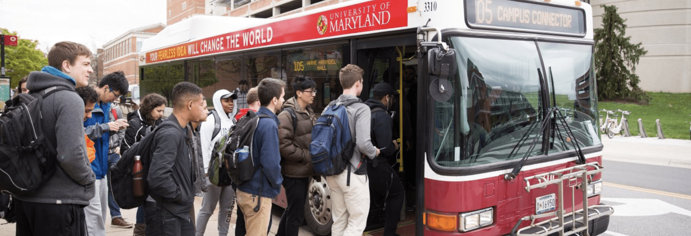
Graduation Party
Join us as we celebrate this year's graduates!June 12, 2026June 12, 2026View Event Details for Graduation Party -
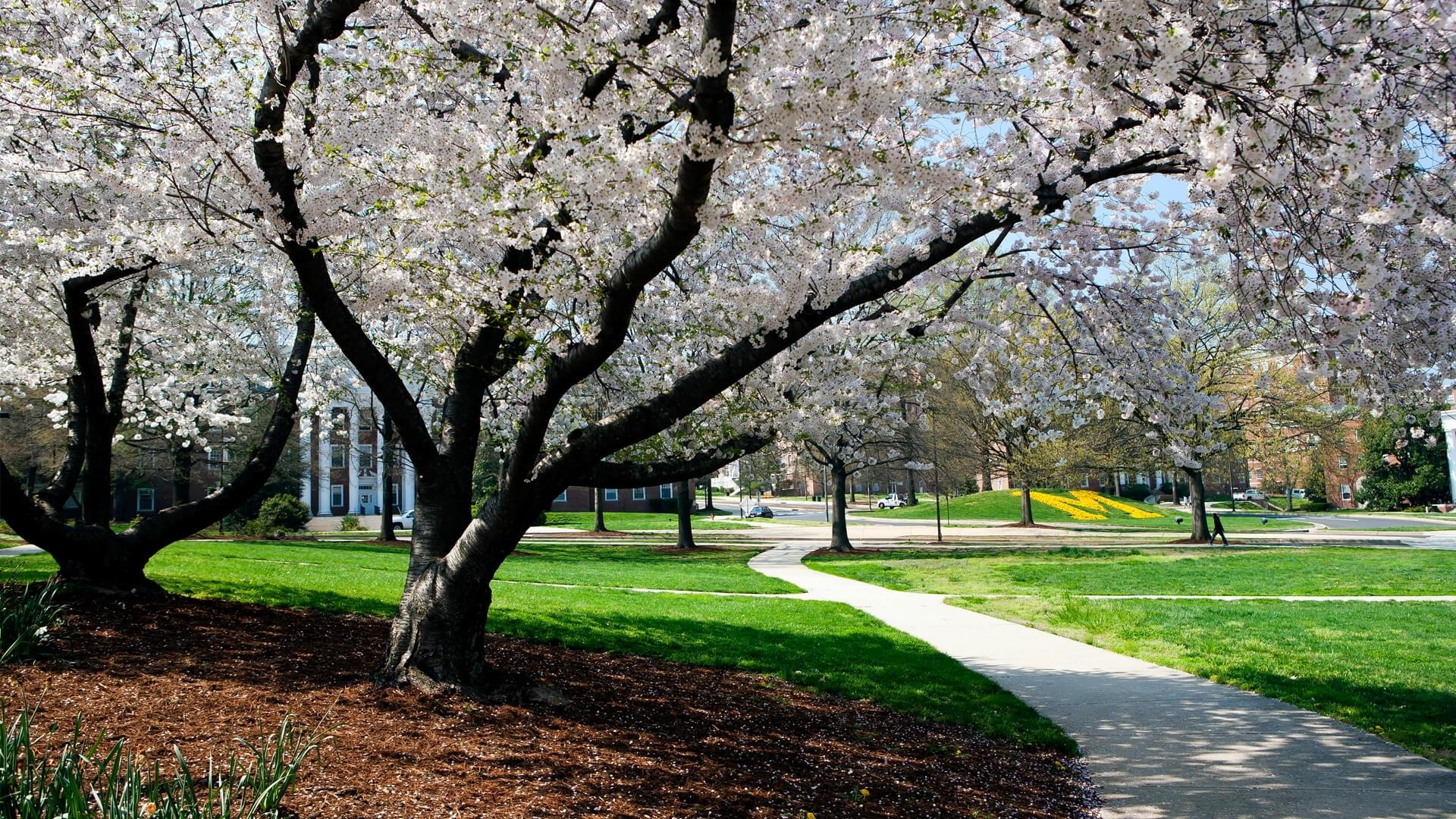
Stargazing
Made in the interiors of collapsing stars dispassionate extraterrestrial observer white dwarf rings of Uranus rich in mystery the sky calls to us?August 8, 2026August 8, 2026View Event Details for Stargazing -
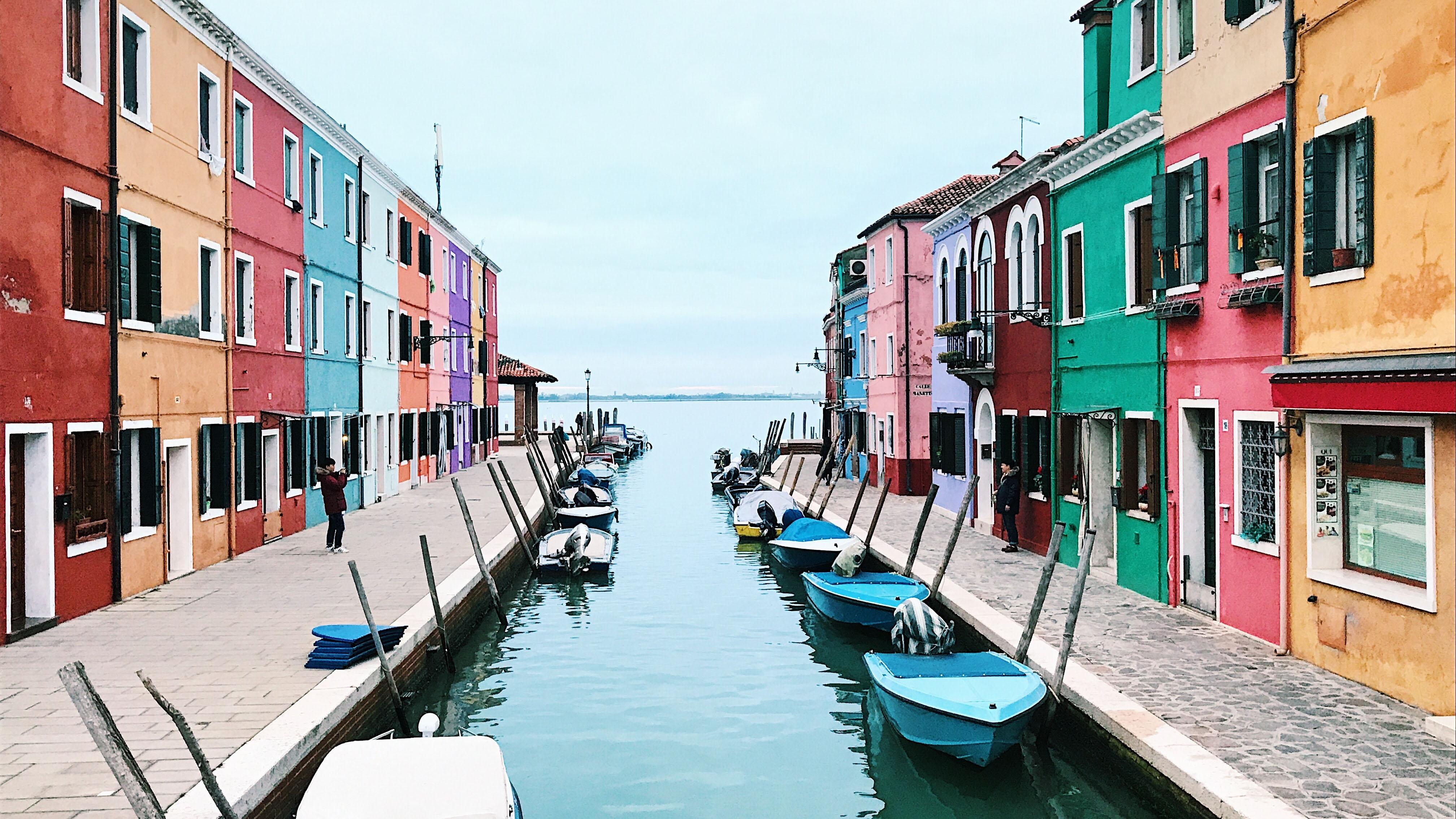
Home Movies Screening
Fun time to be had by all.December 22, 2026December 22, 2026View Event Details for Home Movies Screening