Alternate Homepage: Background Style
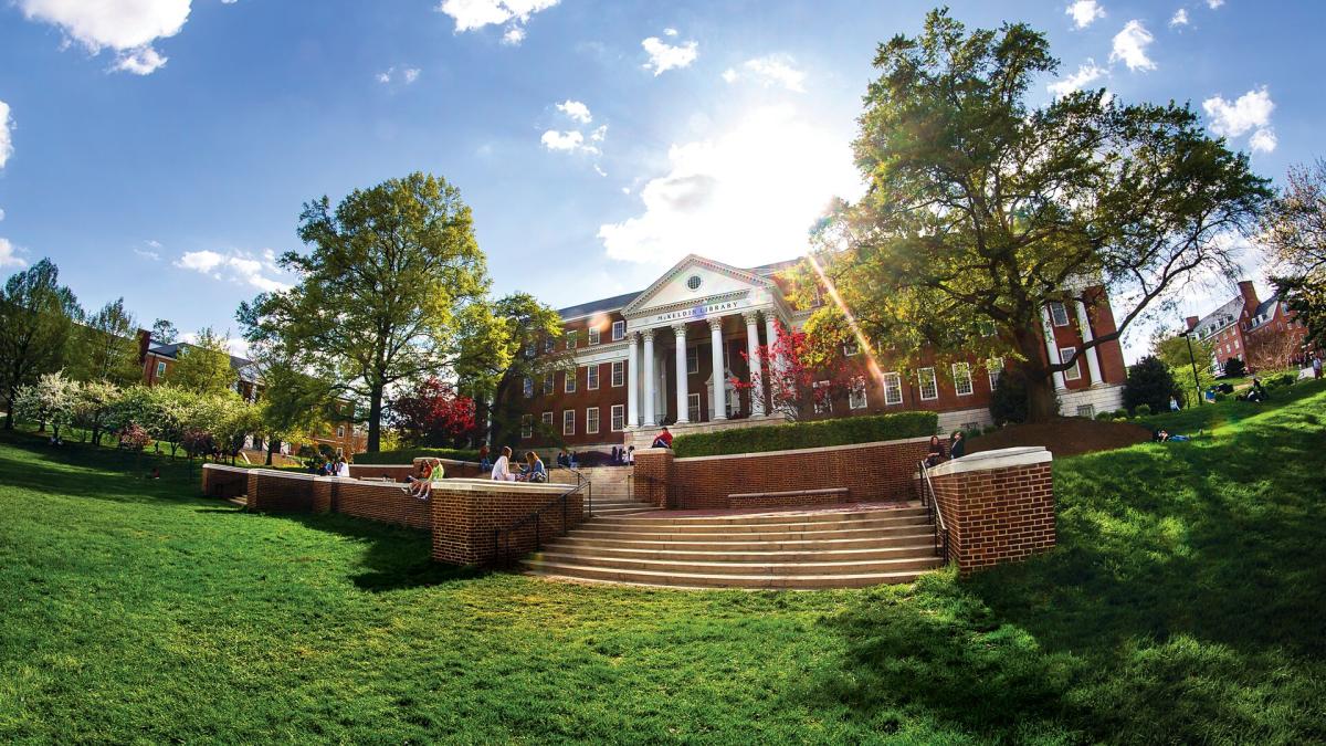
The UMD Terp Homepage layout has special features designed for a site’s home or landing page, but can be used on internal pages where projects or initiatives would benefit from a similar layout to a site’s homepage.
Alerts showcasing a title, body of text, and call to action
The Alerts widget provides a space to inform visitors on temporary, but important information specific to that organization (ie: Early closures, immediate changes to a program, etc). Alerts have fields Titles, text, and a Button, and can get setto one of three colors.
Alert Text on a Yellow Background
Alert Text areas support the same formatting options as standard text widget including Normal text, Headings 2 through 6, Links, Bold, Italics, Numbered lists, Bulleted lists, Blockquotes, and Images.
Alert Text on a Red Background
Alert Text areas support the same formatting options as standard text widget including Normal text, Headings 2 through 6, Links, Bold, Italics, Numbered lists, Bulleted lists, Blockquotes, and Images.
Alert Text on a Gray Background
Alert Text areas support the same formatting options as standard text widget including Normal text, Headings 2 through 6, Links, Bold, Italics, Numbered lists, Bulleted lists, Blockquotes, and Images.
A Feature widget showcases an image, and a panel of text
Text options include a Title, Body of Text, and a link that appears as a button. The background behind the text can be set to 1 of 7 colors.

Text on a White background
Lorem ipsum dolor sit amet
The text area on Feature Widgets support the same basic formatting options as Text Widgets, including Normal text, Headings 2 through 6, Link styles, Bold, Italics, Numbered lists, Bulleted lists, Blockquotes, and Images.
Text on a Light Gray background
Lorem ipsum dolor sit amet
The text area on Feature Widgets support the same basic formatting options as Text Widgets, including Normal text, Headings 2 through 6, Link styles, Bold, Italics, Numbered lists, Bulleted lists, Blockquotes, and Images.
Text on a Gray background
Lorem ipsum dolor sit amet
The text area on Feature Widgets support the same basic formatting options as Text Widgets, including Normal text, Headings 2 through 6, Link styles, Bold, Italics, Numbered lists, Bulleted lists, Blockquotes, and Images.
Text on a Red background
Lorem ipsum dolor sit amet
The text area on Feature Widgets support the same basic formatting options as Text Widgets, including Normal text, Headings 2 through 6, Link styles, Bold, Italics, Numbered lists, Bulleted lists, Blockquotes, and Images.
Text on a Dark Red background
Lorem ipsum dolor sit amet
The text area on Feature Widgets support the same basic formatting options as Text Widgets, including Normal text, Headings 2 through 6, Link styles, Bold, Italics, Numbered lists, Bulleted lists, Blockquotes, and Images.
Text on a Yellow background
Lorem ipsum dolor sit amet
The text area on Feature Widgets support the same basic formatting options as Text Widgets, including Normal text, Headings 2 through 6, Link styles, Bold, Italics, Numbered lists, Bulleted lists, Blockquotes, and Images.
Text on a Black background
Lorem ipsum dolor sit amet
The text area on Feature Widgets support the same basic formatting options as Text Widgets, including Normal text, Headings 2 through 6, Link styles, Bold, Italics, Numbered lists, Bulleted lists, Blockquotes, and Images.

"Background" Image Styled Feature (Reversed)
The text area on Feature Widgets support the same basic formatting options as Text Widgets, including Normal text, Headings 2 through 6, Link styles, Bold, Italics, Numbered lists, Bulleted lists, Blockquotes, and Images.
"Background" image Styled Feature
The text area on Feature Widgets support the same basic formatting options as Text Widgets, including Normal text, Headings 2 through 6, Link styles, Bold, Italics, Numbered lists, Bulleted lists, Blockquotes, and Images.