The UMD Terp Homepage layout has special features designed for a site’s home or landing page, but can be used on internal pages where projects or initiatives would benefit from a similar layout to a site’s homepage.
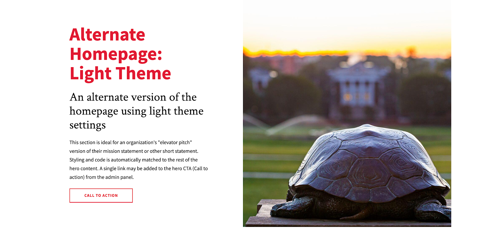
Hero Section
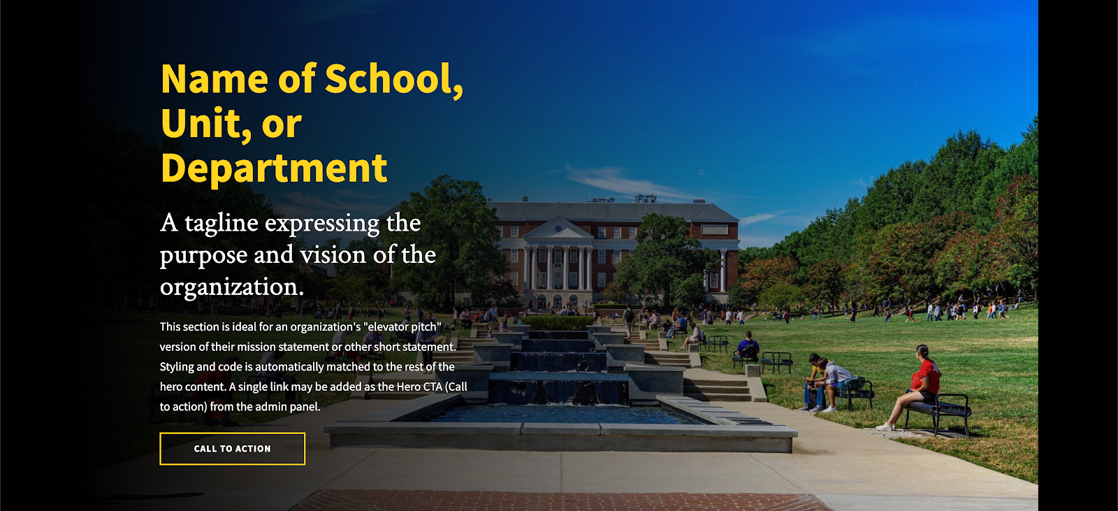
The Homepage layout includes a hero section at the top for titles, a text blurb, a “CTA” or “Call to Action” button, and a single image.
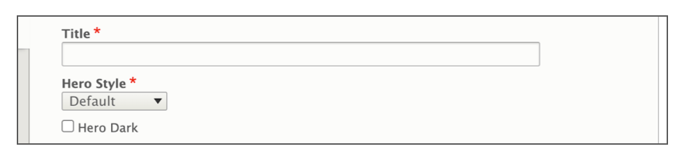
- Title: The required “Title” field is used by drupal for automatically generating links to the page. If this is the main home page of the site, “home” or “index” are recommended here.
- Hero Style: Select a Hero section style.
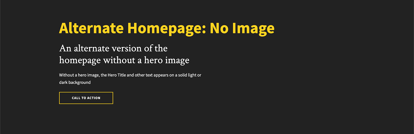
- Style: Choose between “Default” or “Background”. Only select background if you also plan to include a large hero image.
- Hero Dark: Matches the background color of the hero section to the gray background color of the main navigation bar.
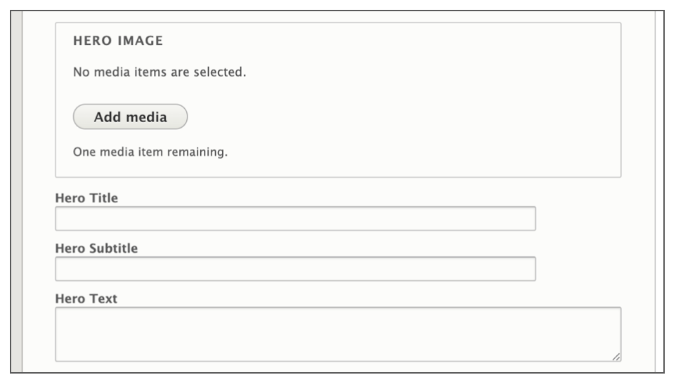
- Hero Image: Include a large image of good quality at the top of the site. Learn more about hero images below.
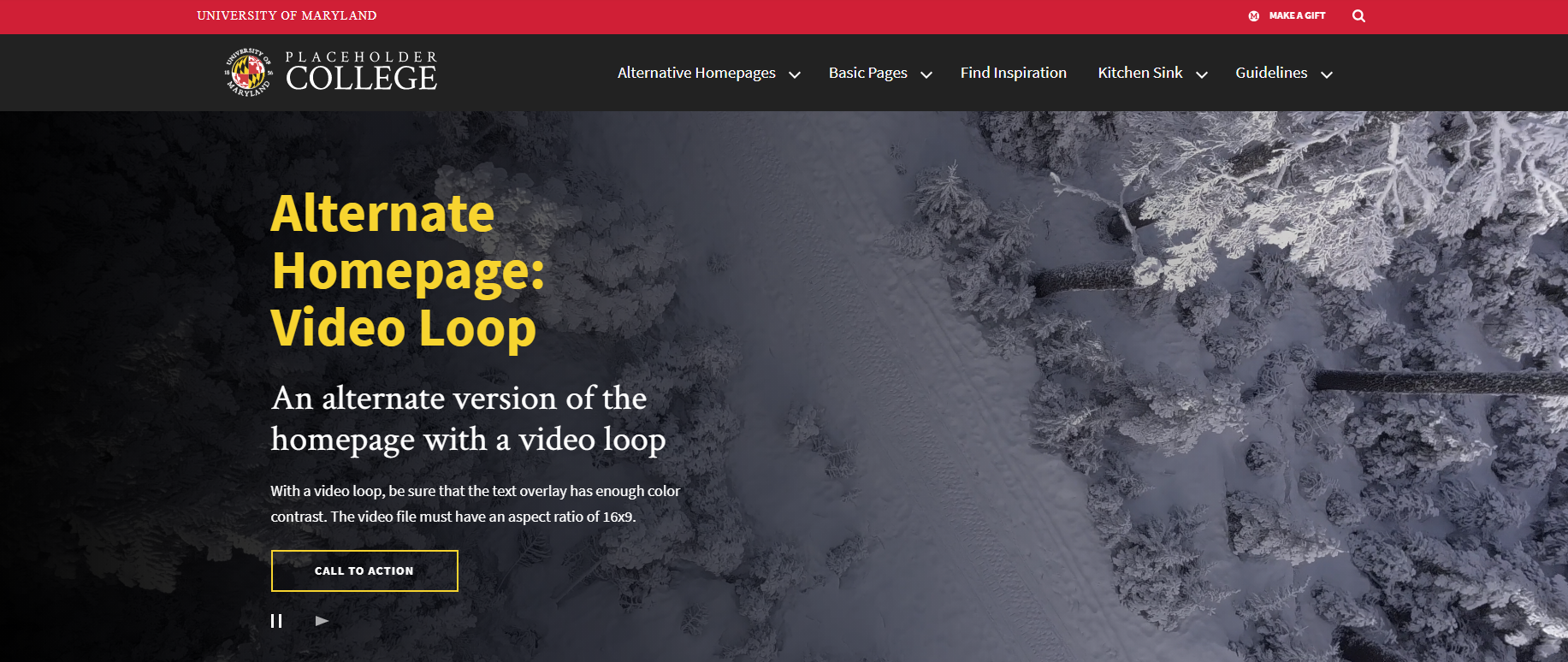
- Hero Video Loop: Include a large, looping video of good quality at the top of the site. Learn more about hero video loops below.
- Hero Title: The Hero Title is the visible title. Usually the name of the school, department or unit should be displayed here.
- Hero Subtitle: a short 120 character or less statement to accompany the hero title.
- Hero Text: A short sentence or two that can be used to expand on the titles above it, or give details about the Call to Action (CTA) below it.
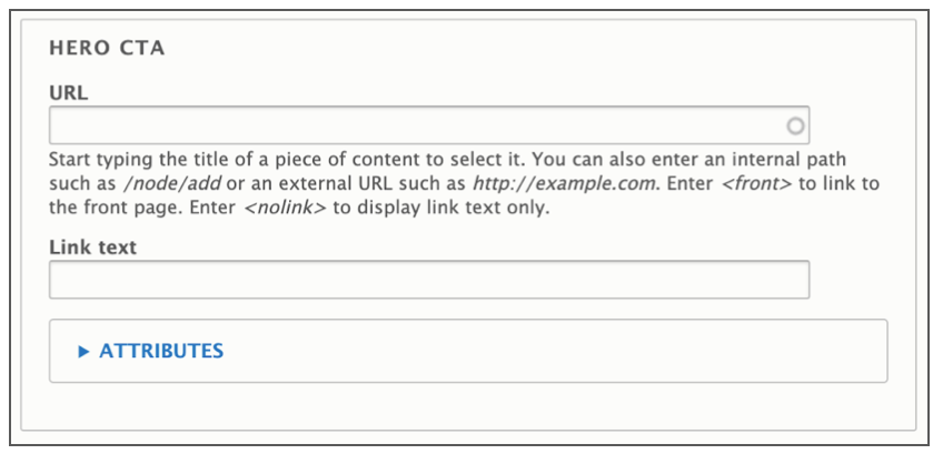
- Hero CTA: The Hero CTA (Call To Action) Button can link to another page on the site, or a completely different site, like the University’s Giving site.
- URL: The URL is the technical term for the web address your Link points to. If you are linking to another page on your site, you don’t need to know the exact address, just the name of the page. If you are linking to a different site (like the University’s Giving site), be sure to include “https://” at the beginning of the address if it isn’t already.
- Link Text: Link Text is the text that will appear inside the button. While the button will display up to 120 characters before truncating it, try to keep link text short to a few words, and with a clear message.
- Target: Inside the attributes dropdown is a “Target” option. The Target dictates whether clicking on this button will open a new window or not. While this option exists, for accessibility purposes, it’s best to leave this option as “none” or “same window” unless linking to a different site entirely.
Adding a Hero Image
- The Hero Image is designed to take up a large portion of the top of the home page. Follow Image size recommendations when selecting an image.
- Click the “Add Media” button.
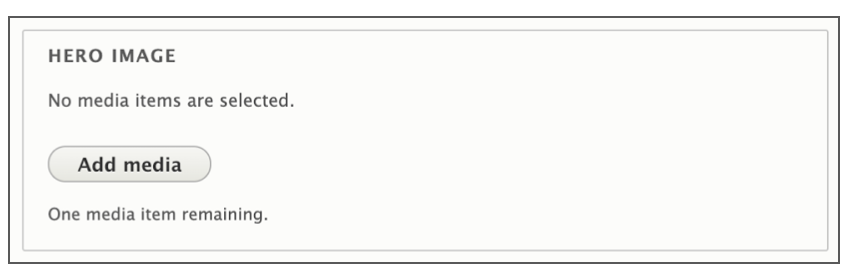
- Select a previously uploaded image from the media library, or follow the same instructions for uploading images, Starting at step 5.
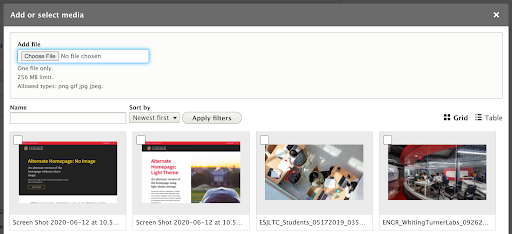
- Reusability: New images will be available for reuse in the media library after upload. You can choose to upload a new image, or select an image from that library.
Adding a Hero Video Loop
- The Hero Video Loop is designed to take up a large portion of the top of the home page. Follow Video length, aspect ratio (16x9), and content recommendations when selecting an image.
- Click the “Add Media” button.
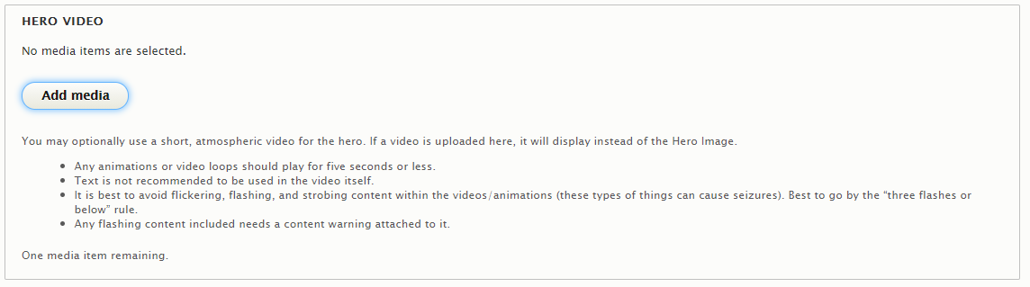
- Select a previously uploaded video from the media library, or follow the same instructions for uploading videos.
Hero Section Examples
Exclusive Widgets
The UMD Terp Homepage supports the same list of widgets described in these guidelines, as well as 2 exclusive widgets designed specifically for a site’s front or other landing page.
Feature Widget
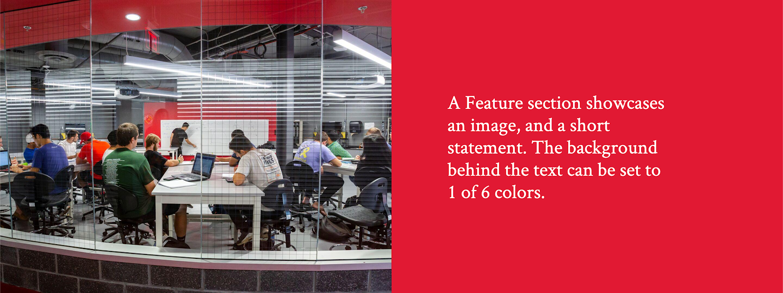
The Feature widget is an image to one side, with text and/or a button inside a box, that can be set to one of 6 different colors.
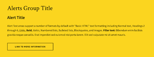
Alerts Widget
The Alerts widget provides a space to inform visitors on temporary, but important/pressing information specific to that organization (ie: Early close or holiday instruction, immediate changes to a program, etc).