The UMD Terp Basic Page layout is the catch all layout for any other internal pages of a site (for example: about page, resources, projects, initiatives, etc).
Basic Settings
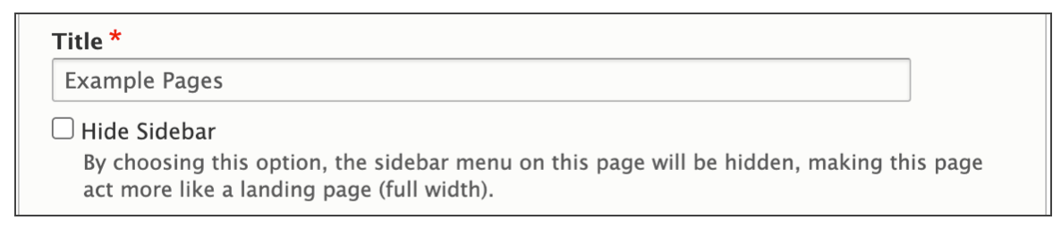
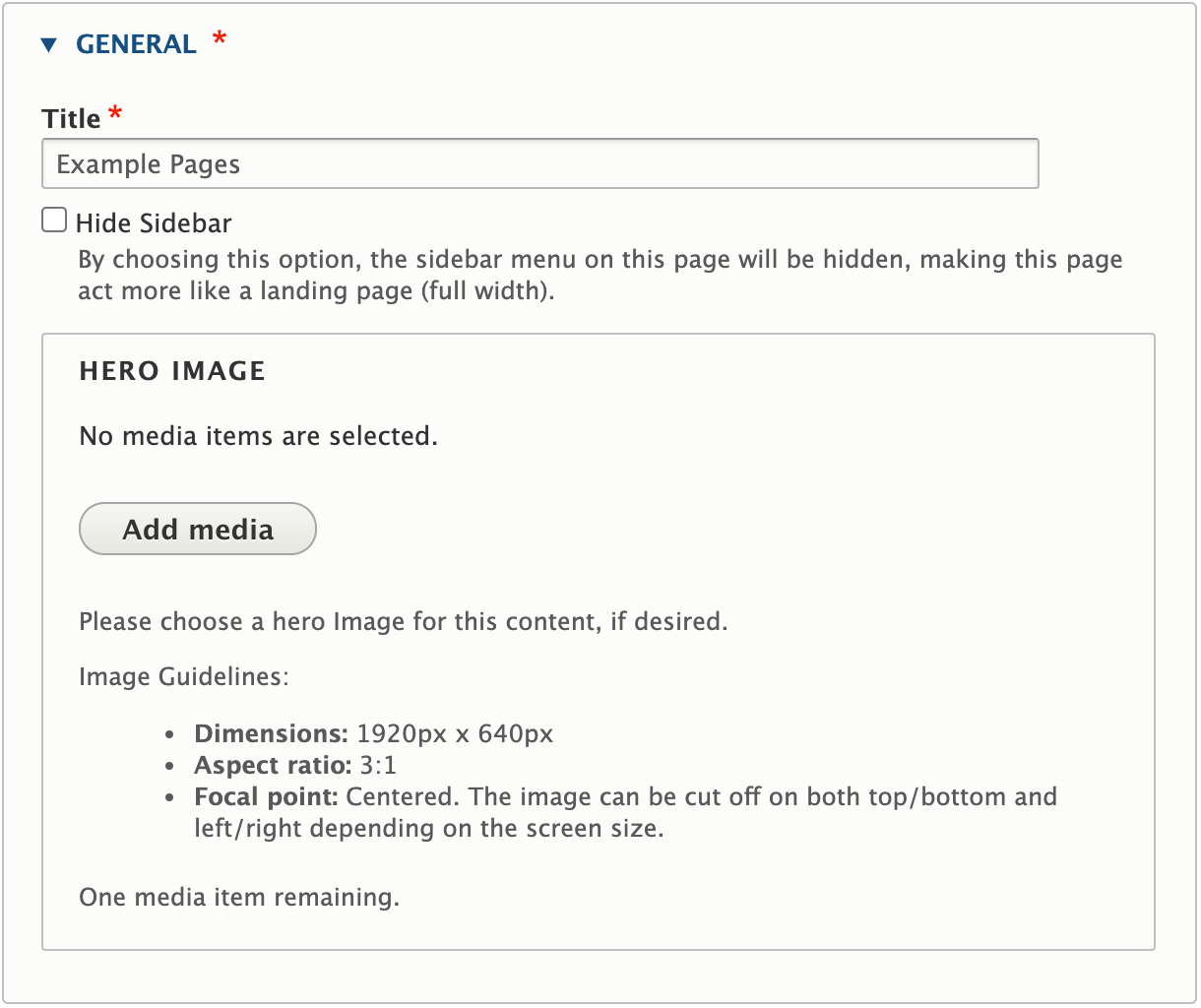
- Title: The Title will appear at the top of the page, and is used when automatically generating links for the page. As the title text appears quite large, keep titles short and eye catching, opt to add extra information into the body.
- Sidebar:
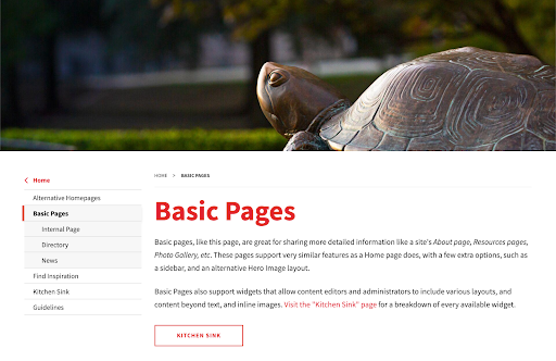
- Hero Image: Basic pages may include a decorative banner image that appears between the main navigation and the page title. Include a large image of good quality at the top of the site. Learn more about the basic page hero images below.
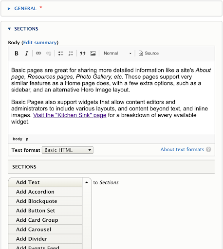
- Body: The Body of the Basic page supports the same text formatting options as the text widget, including Normal text, Heading styles 2 through 6, Links, Bold, Italics, Numbered lists, Bulleted lists, Blockquotes, and inline Images. For accessibility reasons, it is recommended to use headings in numerical order without skipping any.
Widgets Section
In addition to the special fields presented above, the UMD Terp Basic Page supports the addition of the same widgets described in the Available Widget section of these guidelines.
Adding a Hero Image
- The Hero Image on the Basic page will take up the full width of the page, and are cropped to fit as a banner. Follow Image size recommendations when selecting an image.
- Click the “Add Media” button.
- Select a previously uploaded image from the media library, or follow the same instructions for uploading images, Starting at step 5.
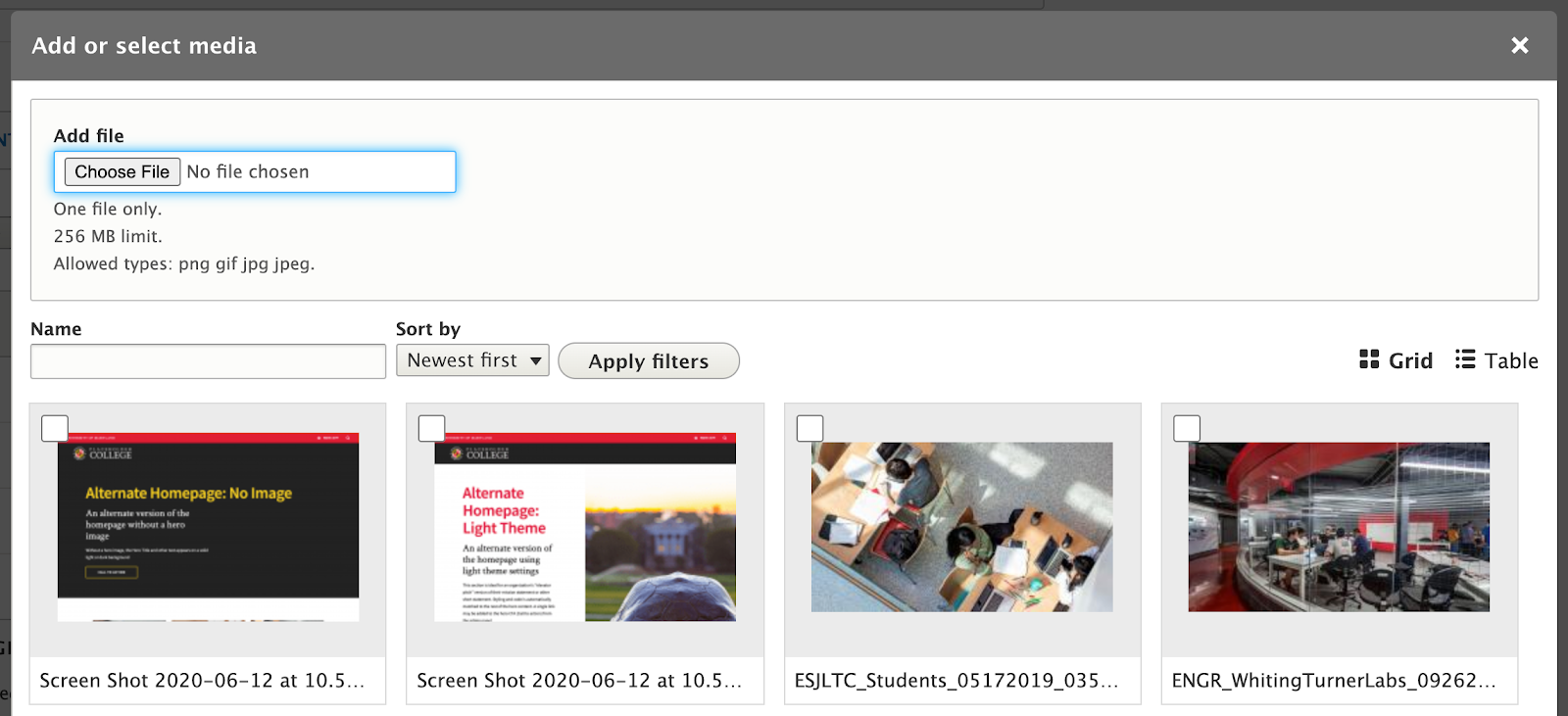
- Reusability: New images will be available for reuse in the media library after upload. You can choose to upload a new image, or select an image from that library.
Front-end View (What it looks like)
Back-end View (What the editor sees)