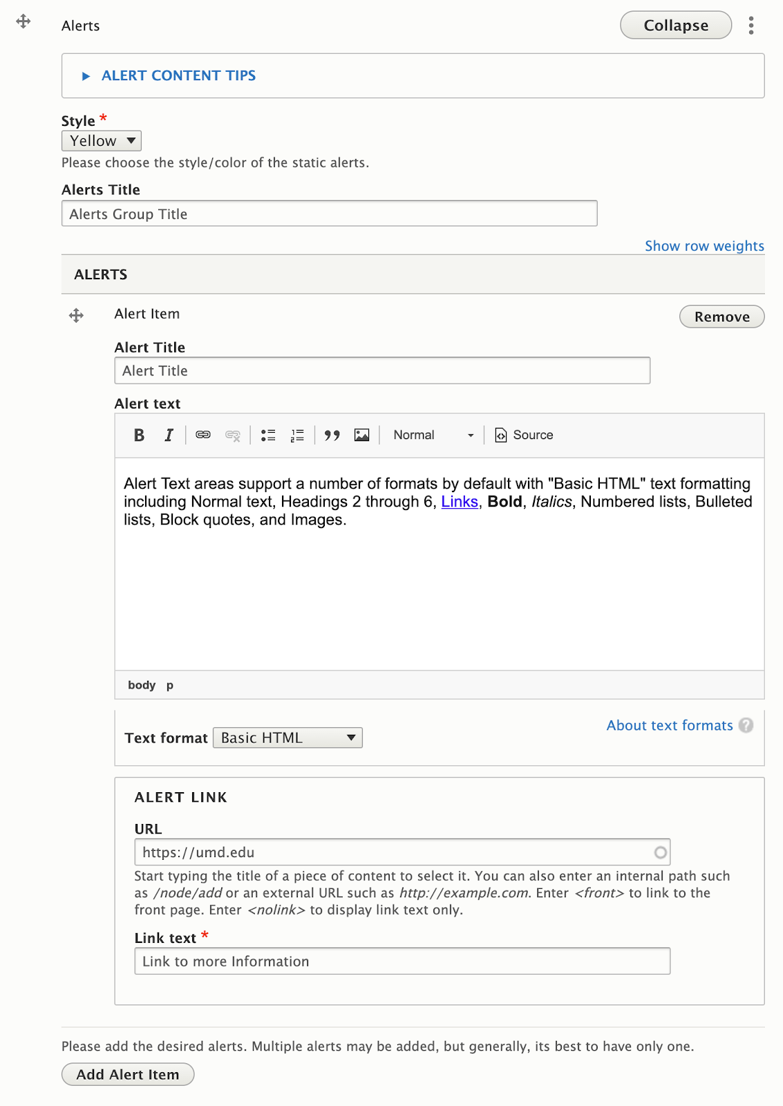
The Alerts widget provides a space to inform visitors on temporary, but important information specific to that organization (ie: Early closures, immediate changes to a program, etc). Alerts have fields Titles, text, and a Button, and can get setto one of three colors.
Adding an Alert Item
- Follow the instructions to add a new widget to your page (Select: “Add Alerts”), or follow the instructions to edit an existing Alerts Widget.
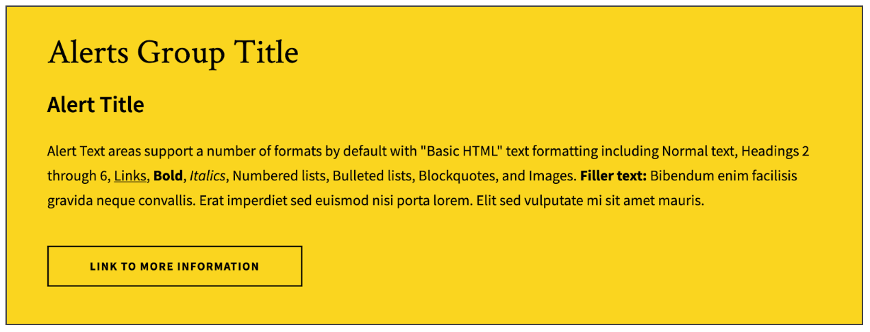
- Click the “Add Alert Item” button at the bottom of the button set widget. Limit to one Alert Item if possible: While multiple alerts can be added as needed, it’s generally best to have only one.
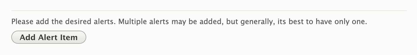
- Change the Alert Item order: Alert Items can be rearranged by clicking and dragging the crossed arrows icon on the left side of the alert you want to move.
Available Fields
Alerts Widget, Global Fields
- Style (Color): Alerts can be styled to one of 3 colors: UMD Red, Yellow, or Gray.
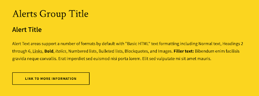
- Alerts Title: The Alerts Title appears once at the top of the widget container. The Alerts title should be short and catchy. They are styled as heading 2 elements, and can be overwhelming if they get too long.
Alert Item Fields
- Alert Title: Where the Alerts Title (plural) appears at the top of the Alerts widget container, the Alert Title is the title for a specific Alert Item. It should also be short and catchy.
- Alert Text: Text areas for Alert Items support the same formatting options as the “text widget. However, we recommend limiting the amount of formatting used, and the length of the content.
- Alert Link: The alert link is styled as a button, and to match the color style of the Alert.
- URL: The URL is the technical term for the web address your Link points to. If you are linking to another page on your site, you don’t need to know the exact address, just the name of the page. If you are linking to a different site (like the University’s Giving site), be sure to include “https://” at the beginning of the address if it isn’t already.
- Link Text: Link Text is the text that will appear inside the button. While the button will display up to 120 characters before truncating it, try to keep link text short to a few words, and with a clear message.
Front-end View (What it looks like)
Back-end View (What the editor sees)