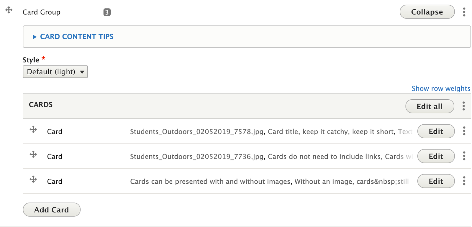
Card groups help break up related content into manageable chunks for easier understanding, or as a teaser for longer articles/pages. The News Feed and Events Feed widgets discussed later in these guidelines use a slightly modified version of this Cards Group widget for styling.
Adding a card to a Card Group
- Follow the instructions to add a new widget to your page (Select: “Add Card Group”), or follow the instructions to edit an existing Card Group.
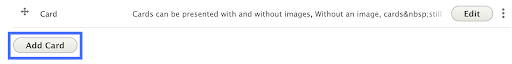
- Click the “Add Card” button at the bottom of the Card Group widget.
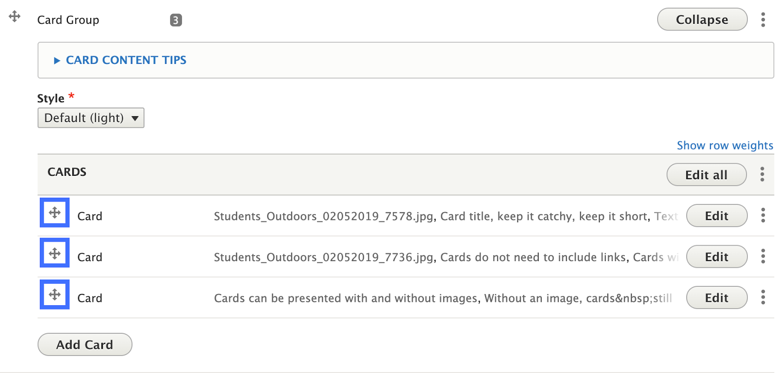
- Note: Cards can be rearranged by clicking and dragging the crossed arrows icon on the left side of the Card you wish to move.
Card fields
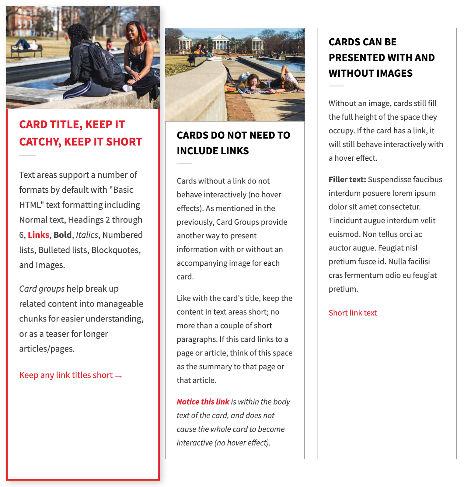
- Image: When added, images appear at the top of a card and are automatically cropped horizontally and resized to fit a ratio of about 3 x 4. Images can be uploaded new or selected from the site’s library of available images.
- Click the “Add Media” button
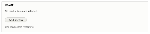
- Select a previously uploaded image from the media library, or follow the same instructions for uploading images, Starting at step 5.
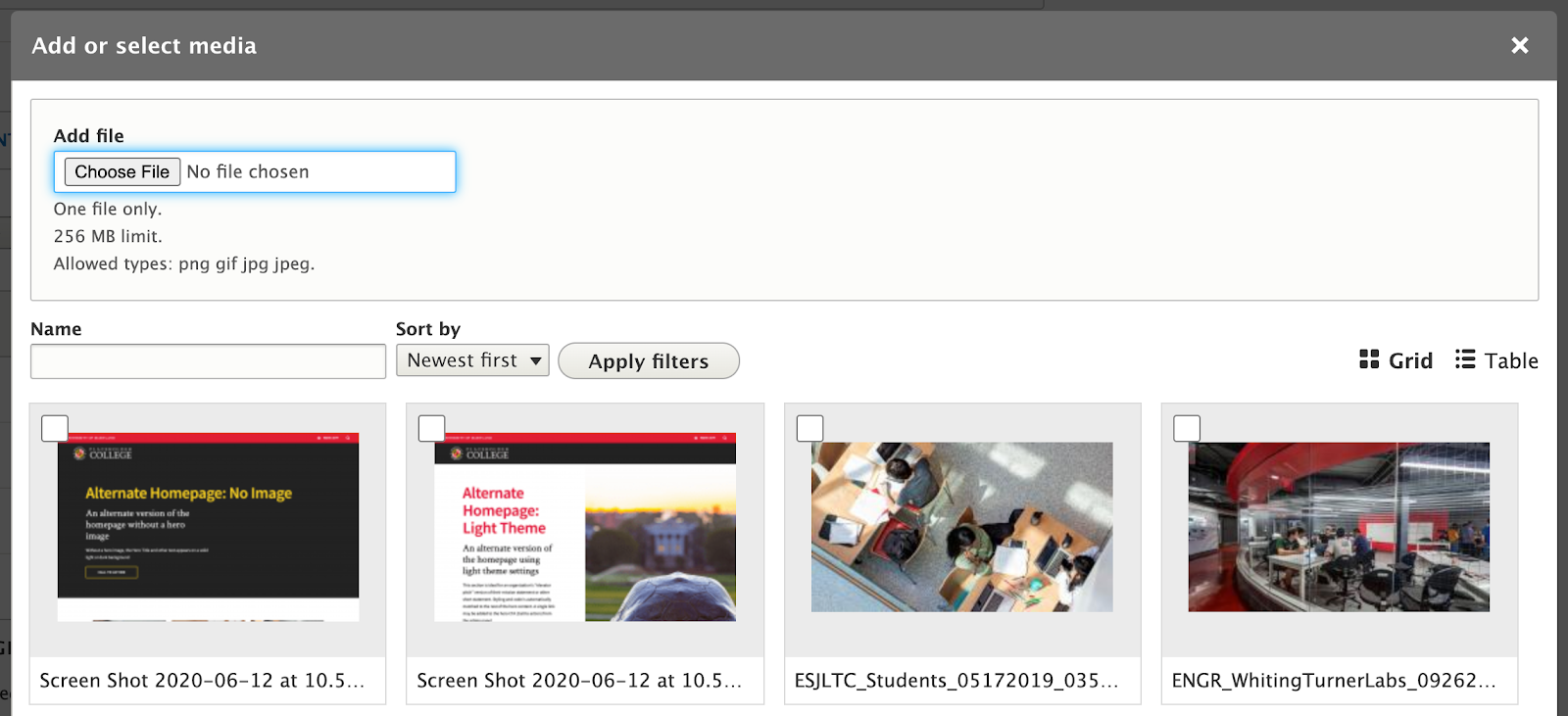
- Reusability: New images will be available for reuse in the media library after upload. You can choose to upload a new image, or select an image from that library.
- Click the “Add Media” button
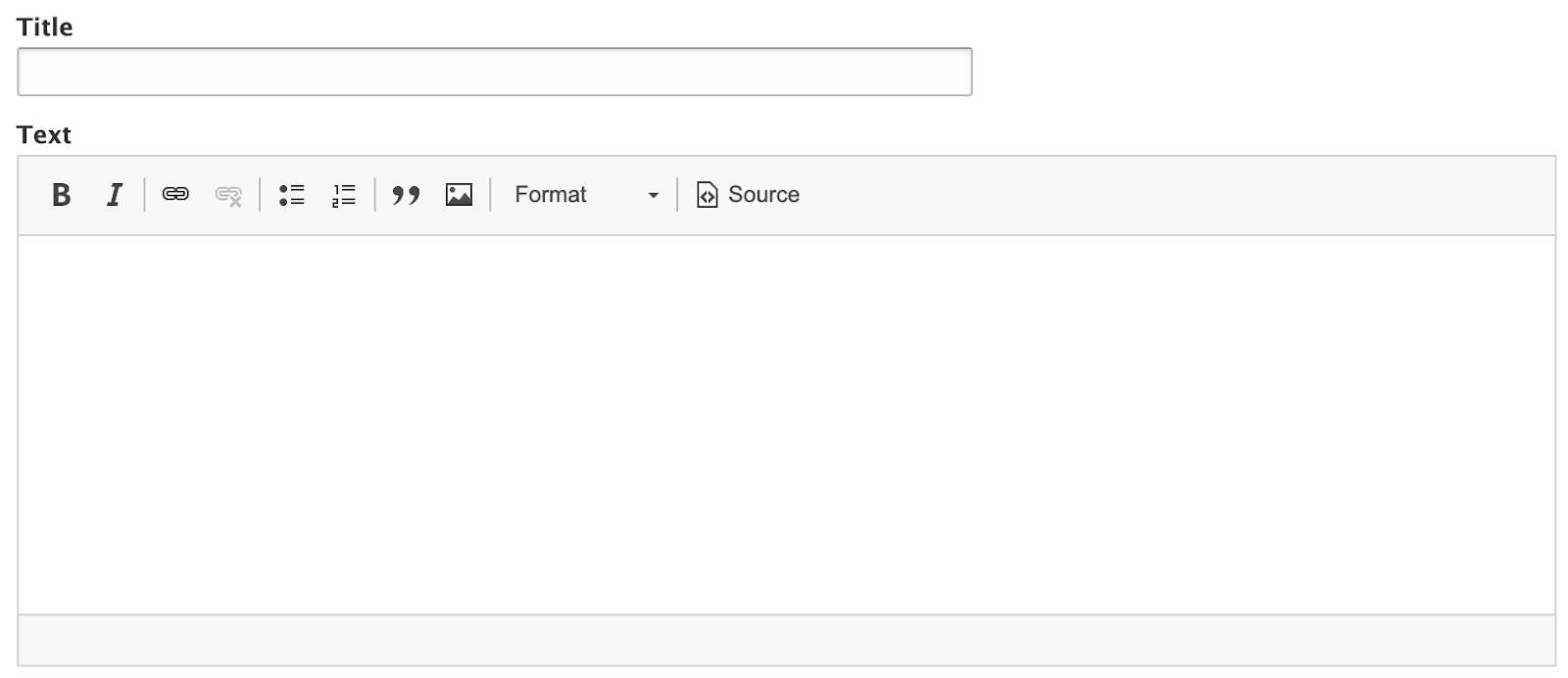
- Title: Keep Card titles Catchy and short. Titles appear bold and in all caps, and can be overwhelming if they get too long.
- Text: Text areas for cards support the same formatting options as the “text widget. However, it is recommended to limit the amount of formatting used, and the length of the content. If you are trying to use card groups to format and layout the contents of a page, try using the 2 column or 3 column widget instead.
- Link: Adding link information will make the whole card interactive. The entire card will be clickable, sending the user to the url provided. On devices that use a mouse or trackpad for navigation, the card will have a hover effect and pop up.
- URL: The URL is the technical term for the web address your Link points to. If you are linking to another page on your site, you don’t need to know the exact address, just the name of the page. If you are linking to a different site (like the University’s Giving site), be sure to include “https://” at the beginning of the address if it isn’t already.
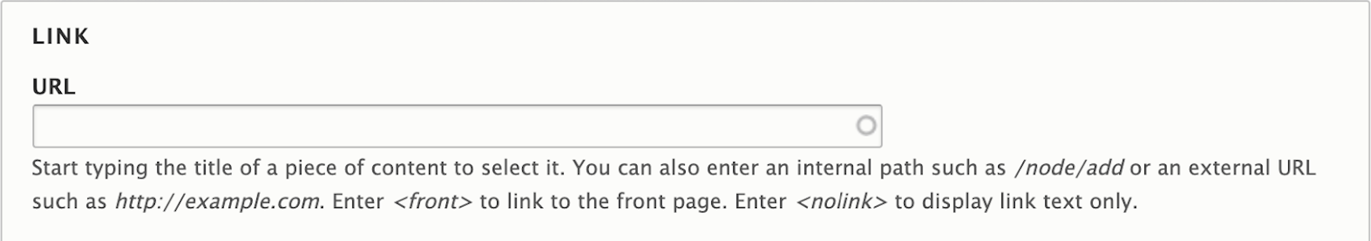
- Link Text: The text that will appear at the bottom of the card. Try to keep link text short, and for accessibility reasons, avoid using generic language like “Read more”, “Click Here”, or “View Page”. Try referencing the name or topic of the page being linked to, even if it's in the title of the card.

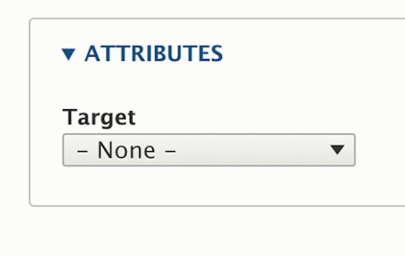
- Target Attribute: Inside the attributes dropdown is a “Target” option. The Target dictates whether clicking on this link will open a new window or not. While this option exists, for accessibility purposes, it’s best to leave this option as “none” or “same window”.
- URL: The URL is the technical term for the web address your Link points to. If you are linking to another page on your site, you don’t need to know the exact address, just the name of the page. If you are linking to a different site (like the University’s Giving site), be sure to include “https://” at the beginning of the address if it isn’t already.
Recommendation
Do
- Use 2 or more cards. Two cards appear in a two-column grid; three or more cards appear in a three-column grid.
- Use images with a horizontal aspect ratio.
- Keep to the character limit specified for headings and text.
- Use plain text. Title and Text should not have styles (bold, italics, etc.).
Don’t
- Use fewer than 2 – or more than 6 – cards at a time.
- Use the "link target" option without good reason. Opening links in new windows automatically is against WCAG 2.0 AAA. There is a strong movement towards letting users decide for themselves to open in a new window or not.
Front-end View (What it looks like)
Back-end View (What the editor sees)