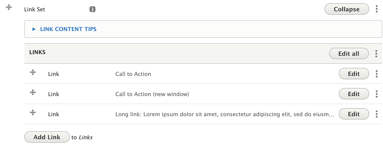
Link Sets offer a way to list a number of links and can be useful for lists of resources you visitors might need. Unlike button sets, Link sets are aligned vertically one under the other. Whether using Button or Link Sets, it is advised to keep titles short. Though Link Sets can support slightly longer titles, as they appear in a vertical list, very longer link titles will be truncated.

Adding a Link to a Link Set
- Follow the instructions to add a new widget to your page (Select: “Add Link Set”), or follow the instructions to edit an existing button set.
- Click the “Add Link” button at the bottom of the button set widget.

- Note: Links can be rearranged by clicking and dragging the crossed arrows icon on the left side of the link you wish to move.
Link Fields
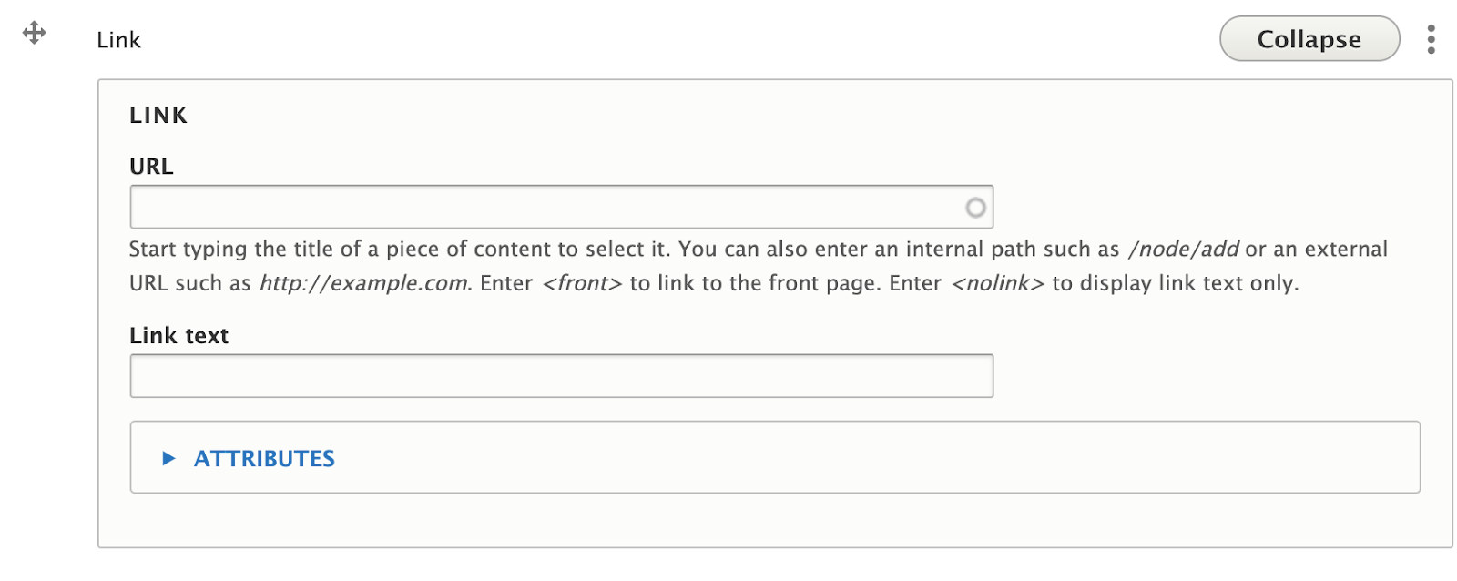
- URL: The URL is the technical term for the web address your Link points to. If you are linking to another page on your site, you don’t need to know the exact address. Typing the name of the page will display a list of pages that contain your search. If you are linking to a different site (like the University’s Giving site), be sure to include “https://” at the beginning of the address if it isn’t already.

- Link Text: Link Text is the text that will appear inside the button. Try to keep link text short as it will return to a new line if it gets too long.
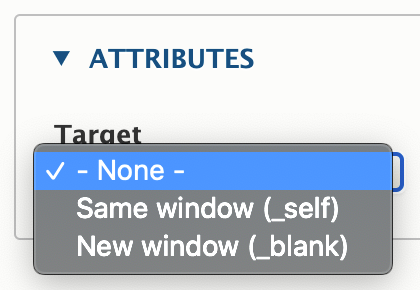
- Target: Inside the attributes dropdown is a “Target” option. The Target dictates whether clicking on this button will open a new window or not. While this option exists, for accessibility purposes, it’s best to leave this option as “none” or “same window” unless linking to a different site entirely.

Recommendations
Do
- Limit the set to one, two or three links. This will avoid overwhelming a user with links, and will help to narrow down choices.
- Define and prioritize the action(s) you want users to take. Use concise, meaningful language to define the Call to Action and what will happen when the user clicks the button.
- Avoid generic language, such as "Click Here."
- Keep text length reasonable. Try to keep link text to 1-3 words. Overly long links can look awkward. If a link has long text, try pairing the button with a heading to break it up.
Don’t
- Use the "link target" option without good reason. Opening links in new windows automatically is against WCAG 2.0 AAA. There is a strong movement towards letting users decide for themselves to open in a new window or not.
Front-end View (What it looks like)

Back-end View (What the editor sees)
