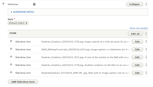
Slideshows display a series of large images, one at a time. Each image takes up the full width of the page’s container. Slideshows are ideal for sharing multiple images within one area of a page where appropriate (ie: images from an event).
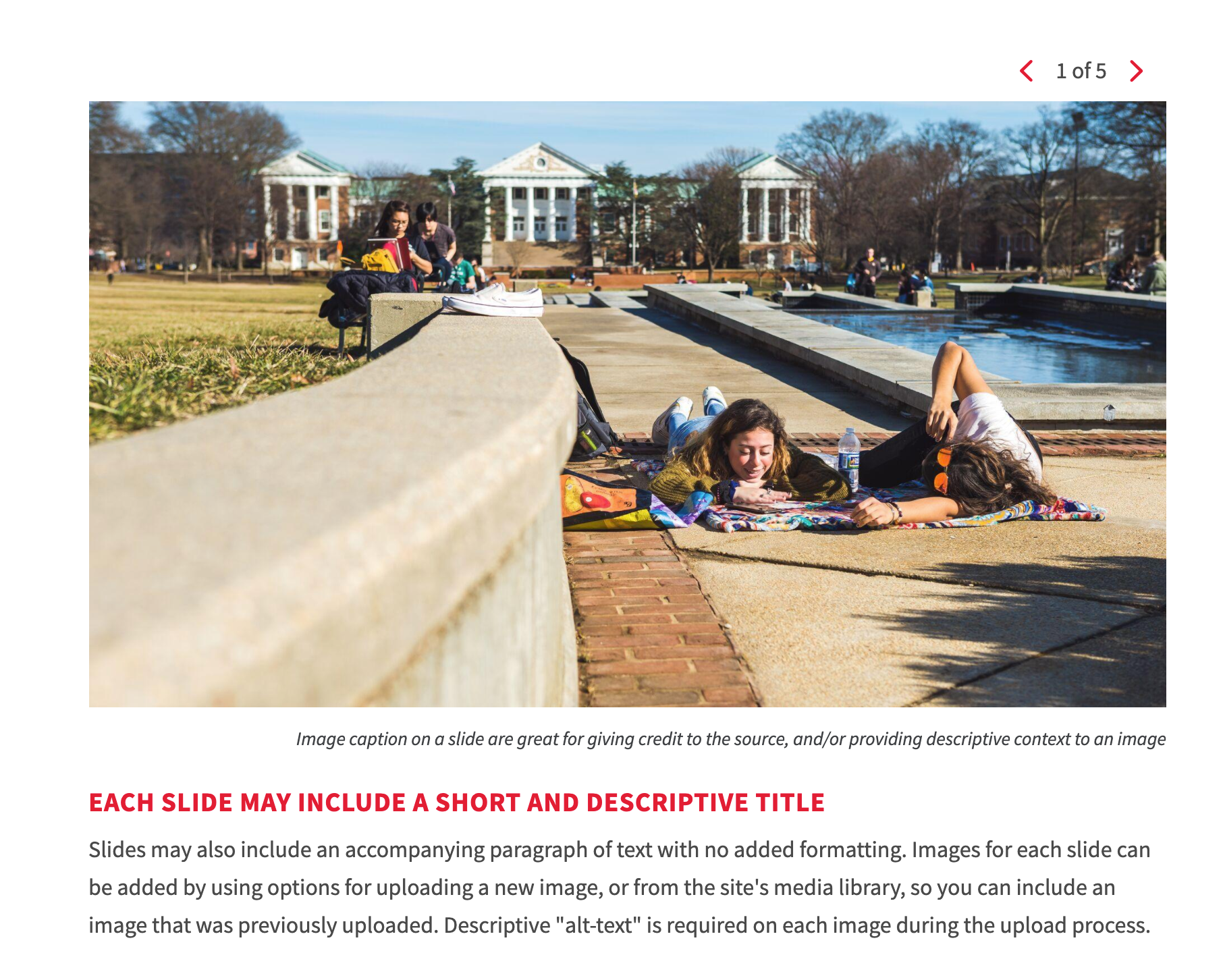
Adding a slide (Slideshow Item) to a slideshow
- Follow the instructions to add a new widget to your page (Select: “Add Slideshow”), or follow the instructions to edit an existing widget.
- Click the “Add Slideshow Item” button at the bottom of the slideshow widget.

- Change Slide order: Slides can be rearranged by clicking and dragging the crossed arrows icon on the left side of the slide you wish to move.
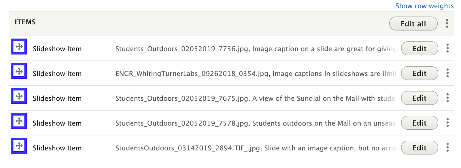
Slideshow Item Fields
- Image: Select large Horizontal images. Images can be uploaded new or selected from the site’s library of available images.
- Click the “Add Media” button

- Select a previously uploaded image from the media library, or follow the same instructions for uploading images, Starting at step 5.
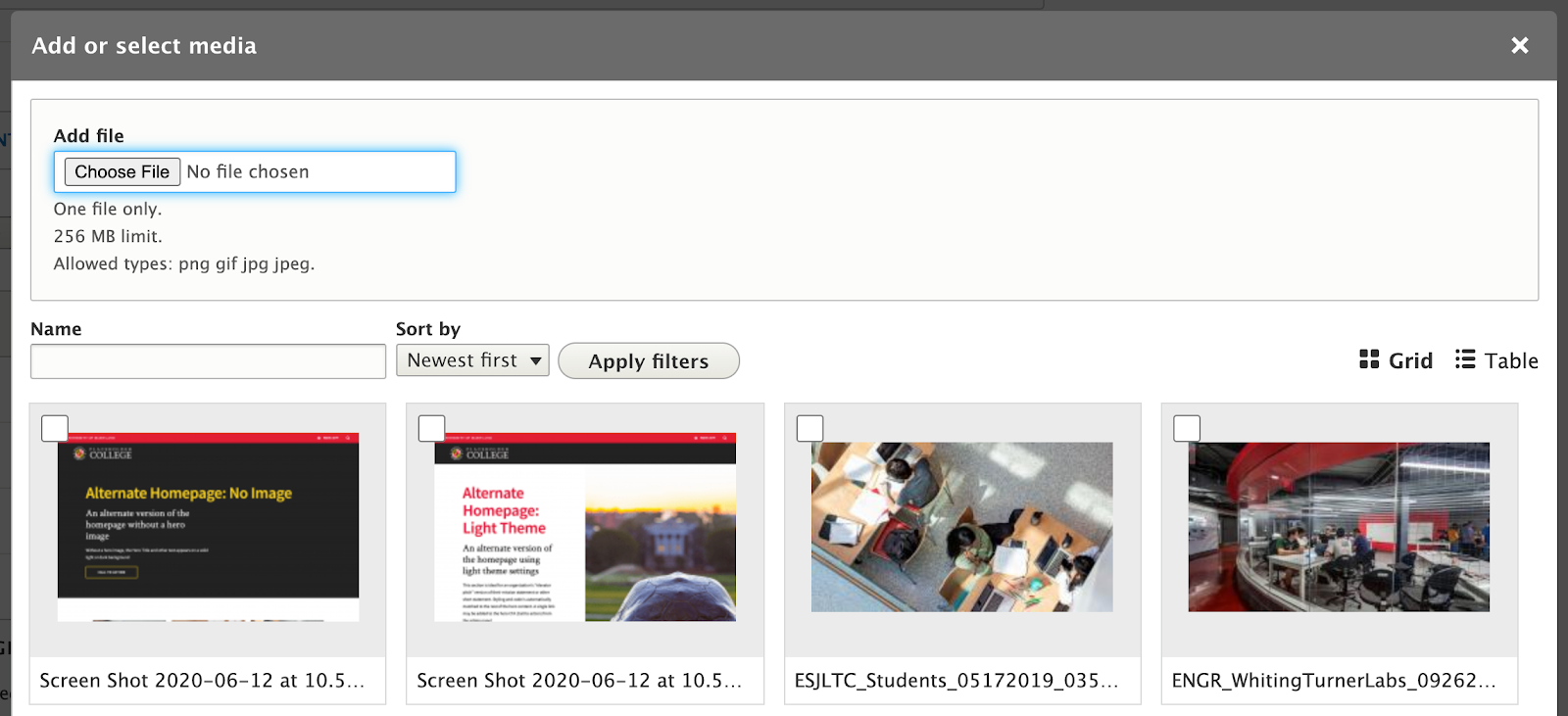
- Reusability: New images will be available for reuse in the media library after upload. You can choose to upload a new image, or select an image from that library.
- Click the “Add Media” button
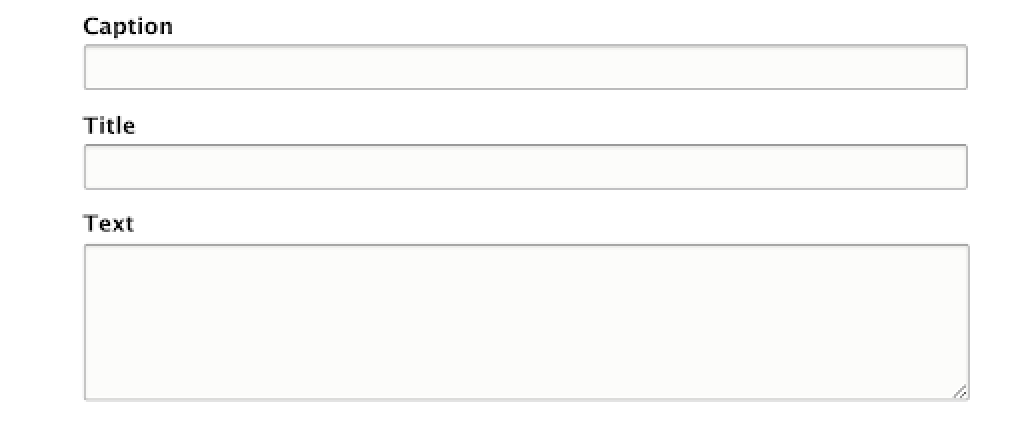
- Caption: The caption appears below each image, and is automatically styled to match the templates. While images uploaded to the site require “alt text” to describe the content of the image to screen readers, the caption might also convey an image’s source, attribution, or reasons for inclusion on the page. The caption does not support formatting (bold italics, etc).
- Title: A short title that will appear below the image and the caption. The title does not support formatting (bold italics, etc), and is automatically formatted to match the templates.
- Text: Each item in a slideshow may also include an accompanying paragraph of text. That text appears below the image of each slide. This particular text field does not support formatting (bold italics, etc).
Recommendations
Do
- Use to showcase photos. Using a slideshow as an image gallery is the best use of carousels.
- Use at least 3 slides. If there is only 1 or 2 slides-worth of content, using a full-width image module may be a better solution.
- Use images with a horizontal aspect ratio. Images in slideshows will all be cropped to have the same aspect ratio so they have a consistent display as a user navigates through the carousel. Portrait or square images may be cropped in an unexpected way.
- Use good, large images. It can look strange when a slide is noticeably lower quality than the others. Smaller images that are unable to go in a slideshow can alternatively be used as inline images with captions.
- Be consistent when using image descriptions. If one image has a description, try to make sure all other images also have descriptions. Make sure the description lengths don’t vary too widely.
Don’t
- Use an image that has text embedded in the image itself. Any text in an image may be cut off in a way you don’t expect. Use the description field to add extra information about an image.
- Use an image that has important features toward the edges. For example, if you are featuring a person, make sure the face is towards the top third and easily visible.
Front-end View (What it looks like)

Back-end View (What the editor sees)
