Accordion widgets provide the ability to share a large amount of content in a more digestible way. Frequently Asked Questions areas are an ideal use case for an Accordion widget.
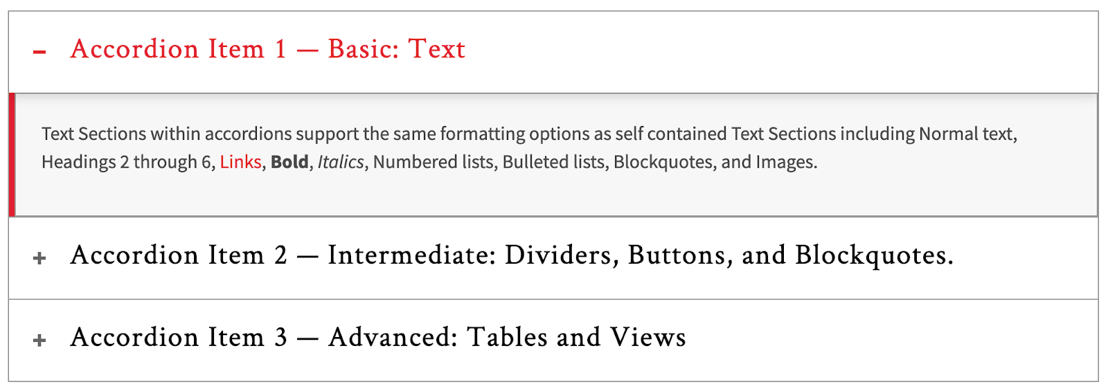
Accordion Item 1
Text widgets within accordions support the same formatting options as self-contained Text widgets including Normal text, Headings 2 through 6, Links, Bold, Italics, Numbered lists, Bulleted lists, Blockquotes, and Images.
Filler Text: Id diam maecenas ultricies mi eget mauris pharetra. Volutpat sed cras ornare arcu dui vivamus arcu felis. Amet nisl suscipit adipiscing bibendum est ultricies. Vel pretium lectus quam id leo in. Blandit volutpat maecenas volutpat blandit aliquam etiam erat velit scelerisque. Enim neque volutpat ac tincidunt vitae semper quis lectus nulla.
Accordion Item 2
Text widgets within accordions support the same formatting options as self-contained Text widgets including Normal text, Headings 2 through 6, Links, Bold, Italics, Numbered lists, Bulleted lists, Blockquotes, and Images.
Filler Text: Id diam maecenas ultricies mi eget mauris pharetra. Volutpat sed cras ornare arcu dui vivamus arcu felis. Amet nisl suscipit adipiscing bibendum est ultricies. Vel pretium lectus quam id leo in. Blandit volutpat maecenas volutpat blandit aliquam etiam erat velit scelerisque. Enim neque volutpat ac tincidunt vitae semper quis lectus nulla.
Accordion Item 3
Text widgets within accordions support the same formatting options as self-contained Text widgets including Normal text, Headings 2 through 6, Links, Bold, Italics, Numbered lists, Bulleted lists, Blockquotes, and Images.
Filler Text: Id diam maecenas ultricies mi eget mauris pharetra. Volutpat sed cras ornare arcu dui vivamus arcu felis. Amet nisl suscipit adipiscing bibendum est ultricies. Vel pretium lectus quam id leo in. Blandit volutpat maecenas volutpat blandit aliquam etiam erat velit scelerisque. Enim neque volutpat ac tincidunt vitae semper quis lectus nulla.
Adding or Editing an Accordion Item
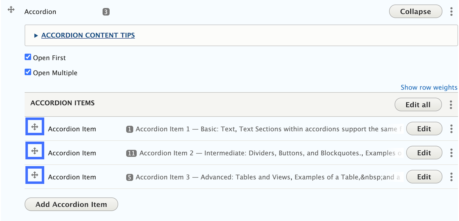
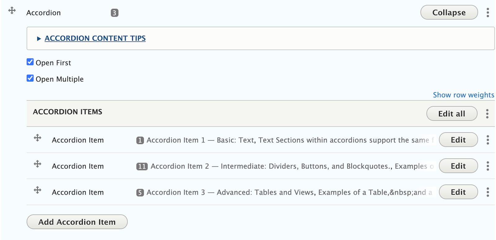
- Once an Accordion widget is added to your page, Click “Add Accordion Item” to add accordion items, or Click “Edit” next to an existing Accordion Item to edit its title or contents.
- Arranging Accordion Items: Accordion items can be rearranged by clicking and dragging the crossed arrows icon on the left side of the accordion item you wish to move.

Adding and Editing the content of an Accordion Item
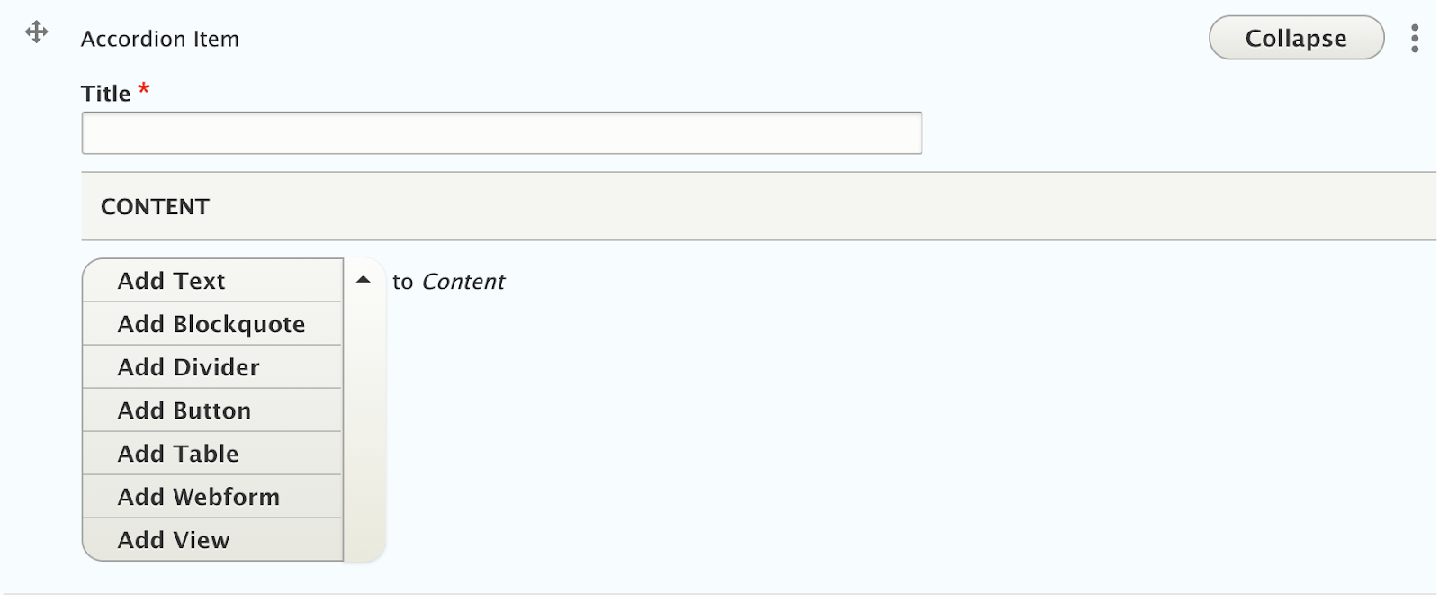
Accordion items have two parts
- Title: The title will appear as the clickable header of the accordion
- Content: The content area offers a subset of the widgets described in these guidelines, including Text, Blockquote, Divider, Button, Table, Webform, and View.
Steps
- Follow instructions to add/edit an accordion item.
- Click on “Add Text” to add a Text section, or click on the downward pointing triangle (▾), and select any of the other available widgets to add it to the accordion item.

Recommendations
- Use 3-6 accordion items. If you only have enough content for 1-2 accordions, it can most likely be organized using basic paragraph styles and widgets.
- Keep headings short. Additional detail can always be put inside the tab as a subheading.
- Keep content length reasonable. Since accordions are hiding information, users may skip over info if it is buried in a super-long accordion. Breaking out information into separate accordions can help. Also, make sure the content isn’t too short; several accordions each containing only a few words to a sentence doesn’t justify the use of that accordion. If you are adding a lot of widgets or content to an accordion, you might also benefit from moving the information to a new, separate page.
- Minimize embedded images and tables. If you’re adding a lot of content to an accordion, consider using a different widget.
Front-end View (What it looks like)

Back-end View (What the editor sees)
