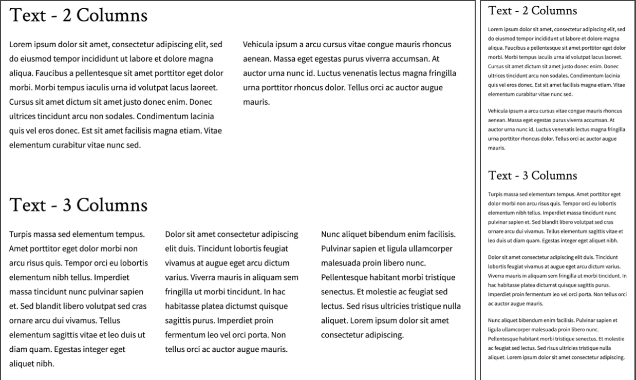
Displays formatted text in a 2 or 3 column layout. There are separate widgets for 2 or 3 column layouts. These two widgets offer the same formatting options as the standard text widget, but allow content editors to layout a page with multiple columns. On mobile, these columns will stack one above the other.
Left Column
Each column in this widget acts as a separate text area and support the same formatting options including Normal text, Headings 2 through 6, Links, Bold, Italics, Numbered lists, Bulleted lists, Blockquotes, and Images.
Filler Text: Id diam maecenas ultricies mi eget mauris pharetra. Volutpat sed cras ornare arcu dui vivamus arcu felis. Amet nisl suscipit adipiscing bibendum est ultricies. Vel pretium lectus quam id leo in. Blandit volutpat maecenas volutpat blandit aliquam etiam erat velit scelerisque. Enim neque volutpat ac tincidunt vitae semper quis lectus nulla. Enim ut sem viverra aliquet eget sit amet. Cras adipiscing enim eu turpis egestas. Netus et malesuada fames ac turpis egestas. Etiam erat velit scelerisque in dictum non consectetur a.
Right Column

Filler Text: Ipsum a arcu cursus vitae congue. Sit amet mattis vulputate enim nulla. Cum sociis natoque penatibus et magnis dis parturient. Nibh tortor id aliquet lectus proin nibh nisl condimentum id. Aliquet enim tortor at auctor urna nunc. Pellentesque dignissim enim sit amet venenatis urna.
Recommendations
Do
- Use the Title field. This heading spans the columns and introduces the content.
- Keep text brief, especially for 3-column layouts. A large amount of text in columns may not be very readable on smaller screens.
- Copy and paste text without formatting. If you’re starting with content in Microsoft Word documents or web pages, make sure you’re not pasting formatting--original colors, font sizes or styles--that you don’t need in this page.
- Use only text in the columns. Images may not display well on small screens.
Don’t
- Use headings just for styling purposes. Headings are meant to help organize content for readers, which is especially important for the visually impaired who may use screen readers. Don’t use a heading just because it has a size, color, or style that looks nice. This may confuse readers.
- Use headings that take up an entire paragraph of text. Headings are meant to be a summary of what you’re going to read. Using a heading for long chunks of text dilutes your message.
- Copy and paste directly from Word or another website. This can carry over colors, type sizes and styles that you don’t want.
Front-end View
What it looks like on a large screen and narrow screen:

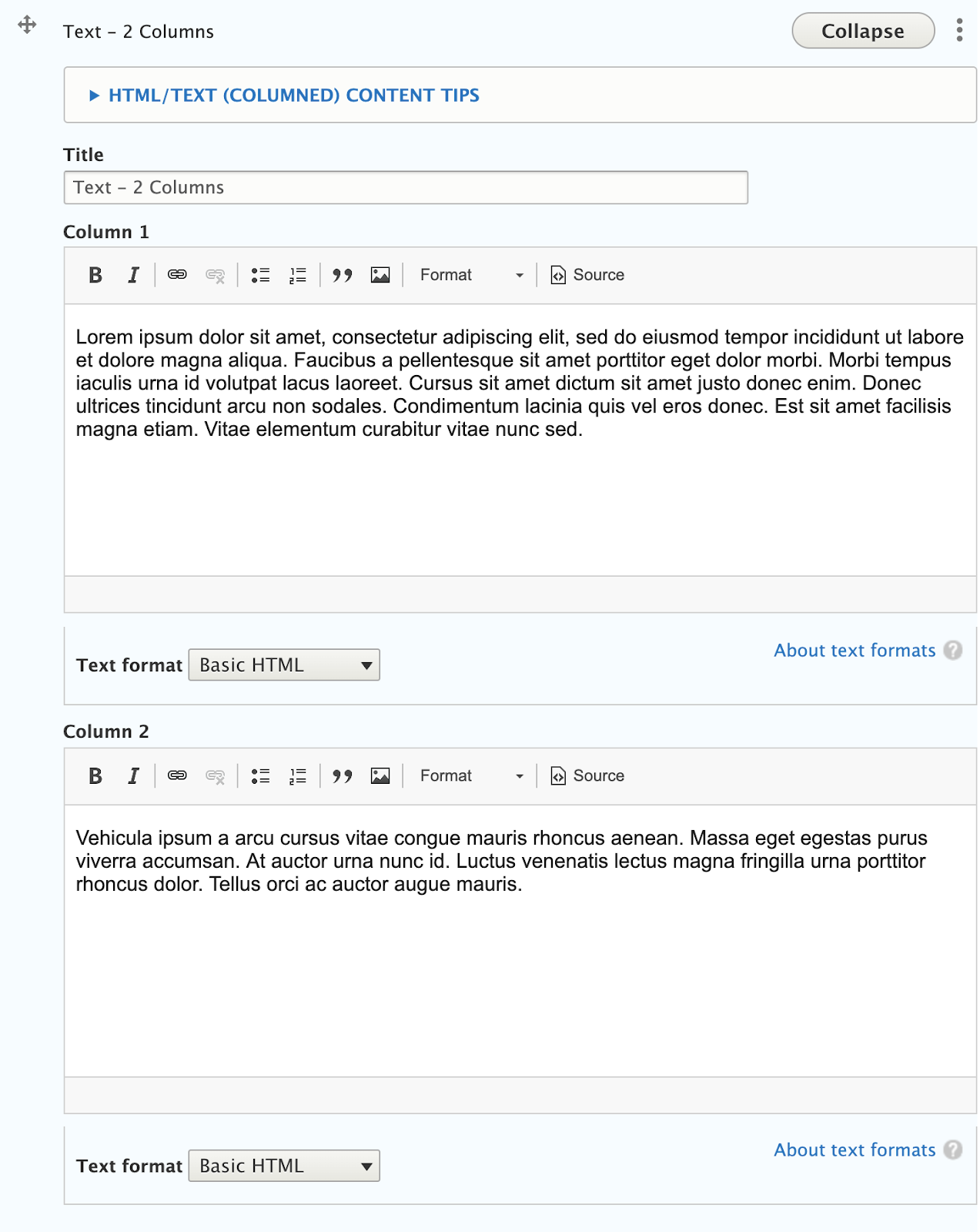
Back-end View
What the editor sees
